
Audience
When it comes to creating a logo for your transport business, it is important to understand your audience. The audience for transport logos can vary greatly depending on the type of transport services you provide. For example, if you are targeting businesses that require shipping and logistics services, your audience may be primarily professionals in the supply chain industry. On the other hand, if you are offering passenger transportation services, your target audience may consist of individuals looking for reliable and comfortable transportation options.
It is crucial to consider the preferences and expectations of your audience when designing your logo. A well-designed transport logo will not only make a lasting impression on potential customers, but it will also help to differentiate your business from competitors in the industry. Incorporating elements that appeal to your target audience, such as symbols or colors associated with trust, reliability, and efficiency, can make your transport logo more appealing and memorable.
Icons
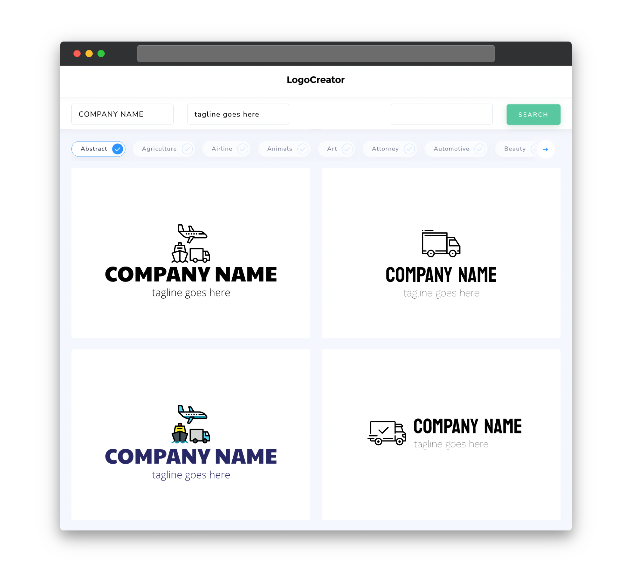
Icons play a vital role in transport logos as they help to visually represent the services you provide. When choosing icons for your transport logo, it is important to consider the specific type of transport services your business offers. For example, if you specialize in air freight, you may want to consider incorporating an airplane icon to represent speed and efficiency. Similarly, if you focus on ground transportation, an icon depicting a truck or a train might be more appropriate.
Icons should be clean, simple, and easily recognizable to ensure that your logo is easily understood by your audience. Avoid using overly complex or detailed icons that can make your logo appear cluttered or confusing. Remember, a well-designed icon will serve as a visual identifier for your transport business, so choose one that best represents your unique value proposition.
Color
Color is a powerful tool when it comes to evoking emotions and creating a memorable brand identity. When selecting colors for your transport logo, consider the message and values you want to convey to your audience. Different colors have different psychological associations, and understanding these associations can help you choose the right color palette for your transport logo.
Blue, for example, is often associated with trust, reliability, and professionalism, which makes it a popular choice for transport logos. Green can symbolize sustainability, growth, and environmental friendliness, which may be suitable for businesses focusing on eco-friendly transportation solutions. Yellow and orange can evoke feelings of energy and excitement, which may be fitting for companies specializing in fast and efficient delivery services.
It is important to choose colors that not only resonate with your audience but also complement each other in your logo design. A harmonious color palette will not only make your logo visually appealing but also help to create a cohesive and consistent brand identity for your transport business.
Fonts
The choice of fonts in your transport logo can greatly influence its overall look and feel. When selecting fonts, it is important to consider legibility and readability, especially when your logo needs to be reproduced in different sizes and formats.
For transport logos, sans-serif fonts are commonly used due to their clean and modern appearance. These fonts are often associated with professionalism and efficiency, making them suitable for businesses in the transport industry. However, depending on your specific brand image and target audience, you may choose to use other font styles, such as serif or script fonts, to give your logo a unique and distinctive look.
Remember to choose fonts that are easy to read, even at smaller sizes, as this will ensure that your logo remains readable and recognizable across different applications and platforms.
Layout
The layout of your transport logo plays a crucial role in creating a visually appealing and balanced design. It is important to consider the overall composition and placement of elements within your logo to ensure that it effectively communicates the message and values of your transport business.
A well-balanced logo will have a clear hierarchy of elements, with the most important elements, such as the company name or icon, being more prominent and easily recognizable. The arrangement of these elements should create a sense of harmony and unity in your logo design.
When designing the layout of your transport logo, also consider how it will appear in different contexts, such as on signage, business cards, or even digital platforms. A versatile layout that works well at different sizes and proportions will ensure that your logo remains impactful and visually appealing across various applications.
Usage
Your transport logo will be used across a variety of platforms and materials, so it is important to consider its usage from the beginning stages of the design process. A well-designed logo will be versatile and adaptable, ensuring that it can be easily reproduced in different sizes, formats, and materials without losing its visual impact.
Consider the different applications your logo will be used for, such as signage, vehicles, uniforms, or digital platforms, and design it accordingly. A logo that is easily scalable and adaptable will allow for consistent branding across various touchpoints, enhancing your professional image and brand recognition.
Additionally, ensure that your logo adheres to any technical specifications required for reproduction, such as color modes, file formats, and resolution requirements. This will ensure that your logo remains visually consistent and retains its quality in whatever medium it is used.
With careful consideration of your audience, appropriate icons, effective use of color and fonts, a well-balanced layout, and versatile usage, you can create a transport logo that effectively represents your business and resonates with your target audience.

