Audience
When it comes to designing a transportation logo, it’s important to understand your target audience. Your logo should reflect the nature of your transportation business and resonate with your intended customers. Whether you’re operating a taxi service, a delivery company, or a logistics firm, your logo should appeal to your target market. Consider the type of customers you want to attract and what they value in a transportation service. This will help you create a logo that effectively communicates your brand identity and connects with your audience, helping you to stand out in a competitive market.
Icons
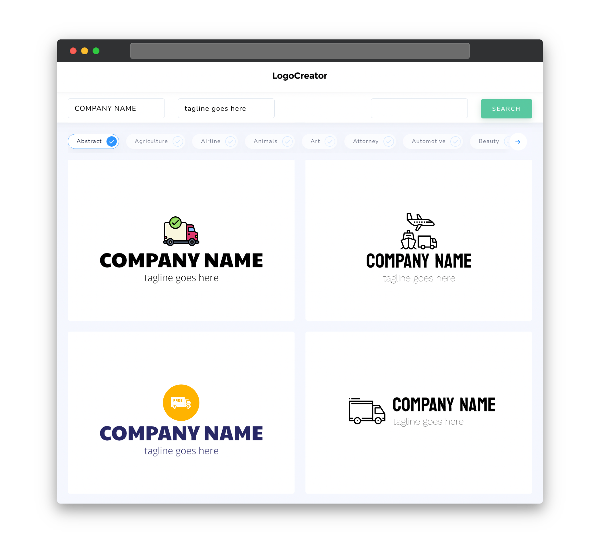
Icons play a crucial role in transportation logos as they can quickly convey the nature of your business. For transportation logo design, consider using icons that represent vehicles, such as cars, trucks, planes, or ships. These icons instantly communicate that your business is connected to transportation and help to establish a visual connection with your audience. Selecting the right icon can add a touch of professionalism and clarity to your logo, making it easier for potential customers to identify and remember your brand.
Color
Color is a powerful element in logo design, and it can evoke specific emotions and perceptions. When choosing colors for your transportation logo, consider the industry standards and the message you want to convey. Blue is often associated with trust, reliability, and professionalism, which are important qualities for transportation businesses. Green can symbolize sustainability, growth, and security. Yellow can represent energy, speed, and enthusiasm. Red can evoke urgency, power, and excitement. However, it’s important to choose colors that align with your brand personality and resonate with your target audience.
Fonts
Fonts play a crucial role in transportation logo design as they can convey the personality and tone of your brand. When selecting fonts for your logo, it’s important to consider readability and legibility, as transportation logos often need to be quickly understood. Sans-serif fonts are commonly used in transportation logos as they are clean, modern, and easy to read. However, you can also experiment with serif fonts if you want to convey a sense of tradition and elegance. Ultimately, the font you choose should align with your brand identity and effectively communicate your message.
Layout
The layout of your transportation logo should be simple, clean, and balanced. Avoid clutter and excessive details that can make the logo appear busy or confusing. Consider the different elements of your logo, such as the icon, text, and any additional graphics, and ensure they are arranged in a harmonious way. A well-designed transportation logo typically features a clear focal point, where the main icon or visual element stands out, capturing attention and making a memorable impression. Experiment with different layouts to find the one that best represents your transportation business and resonates with your target audience.
Usage
Once you have created your transportation logo, it’s important to consider its usage across different platforms and materials. Your logo should be scalable and flexible, allowing it to be easily used in various sizes and formats. It should be legible when reproduced in small sizes, such as on social media profiles or business cards, as well as impactful when larger, such as on signage or vehicles. Consider the different color variations and orientations of your logo to ensure it maintains its integrity and recognition across different applications. By carefully considering the usage of your transportation logo, you can ensure that it effectively represents your brand in all contexts.


