Audience
When it comes to designing a logo for your trucking company, it is essential to understand your target audience. In this case, your primary audience consists of potential clients who are seeking reliable, efficient, and professional trucking services. By creating a logo that appeals to this audience, you can effectively communicate the values and qualities that set your trucking company apart from the competition. It is crucial to keep in mind that your logo should convey a sense of trust, dependability, and expertise in the transportation industry. A well-designed trucking company logo will not only attract potential clients but also instill confidence in your existing customer base.
Icons
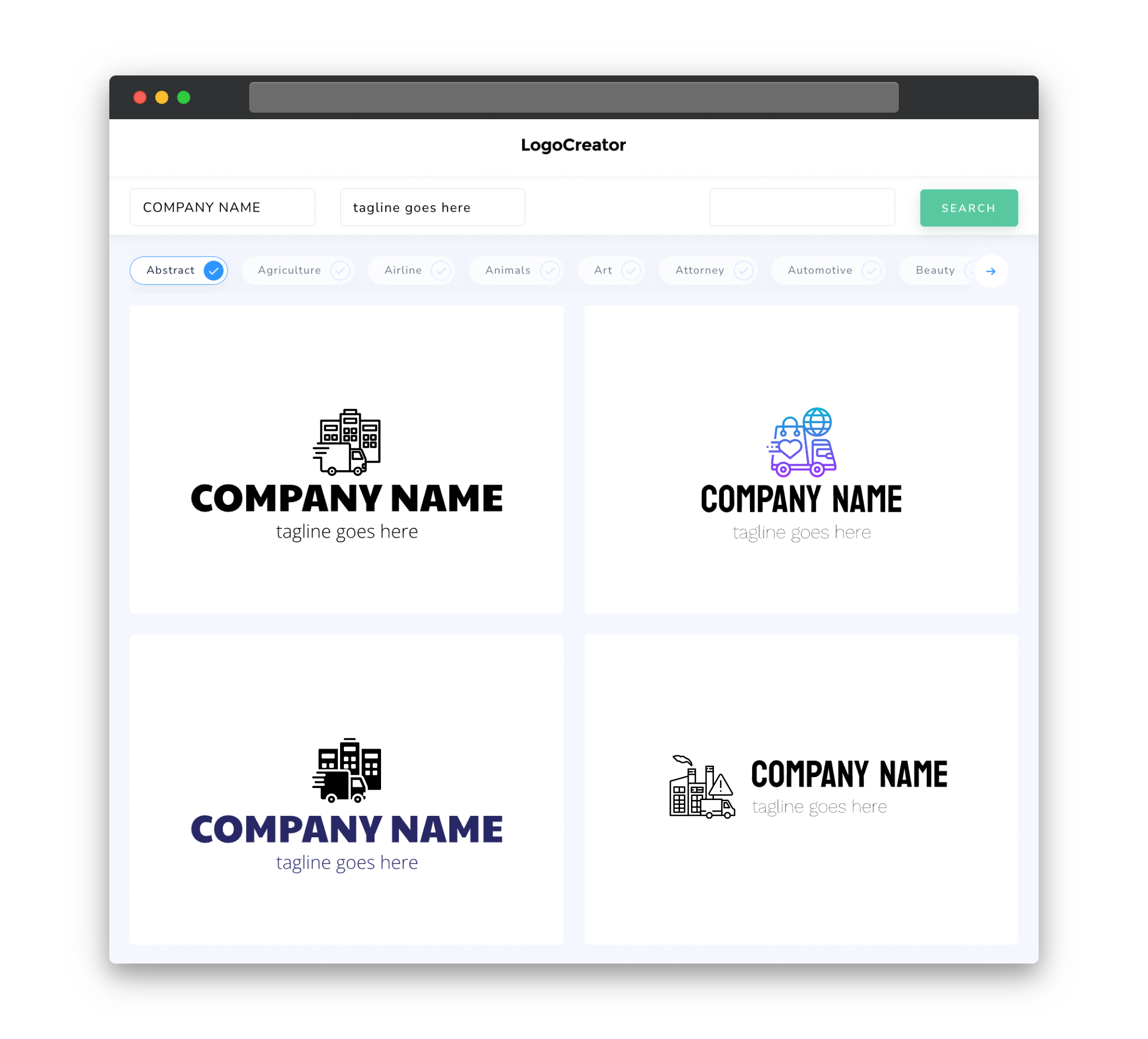
Choosing the right icons for your trucking company logo is crucial in creating a strong brand identity. Consider incorporating symbols that are associated with the transportation industry, such as trucks, highways, cargo, or delivery-related elements. These icons can help convey the nature of your business at a glance and create an immediate visual connection with your audience. Simplicity is key when it comes to designing icons for your logo. Well-crafted, clean, and recognizable icons will ensure that your logo remains memorable and easily recognizable, even from a distance or at small sizes.
Color
When considering colors for your trucking company logo, it is important to select hues that resonate with your brand identity and evoke the desired emotional response from your audience. Colors commonly associated with the transportation industry include bold shades, such as deep blues, vibrant reds, or strong blacks. These colors can represent strength, reliability, and professionalism. Additionally, consider contrasting colors that provide a visual impact and enhance the visibility of your logo. The right color combination will not only make your logo visually appealing but also help your trucking company stand out among competitors.
Fonts
Choosing the right fonts for your trucking company logo can help convey the desired message and create a professional and trustworthy brand image. Sans-serif fonts often work well for trucking company logos as they have a clean and modern look. Additionally, opting for bold or heavy weights can add a sense of stability and strength to your logo. However, it is important to strike a balance between readability and aesthetics. Remember that your logo will need to be legible even at smaller sizes, such as on business cards or websites. Fonts that are easily readable and have a timeless appeal will ensure that your logo remains effective for years to come.
Layout
The layout and arrangement of elements in your trucking company logo play a crucial role in communicating your brand’s message effectively. Consideration should be given to the placement of icons, text, and other design elements. A well-balanced and symmetrical logo layout conveys a sense of professionalism and stability, while an asymmetrical design can add a touch of modernity and creativity. It is important to ensure that all elements are harmoniously integrated and easily identifiable. Striking the right balance between visual appeal and clarity will result in a well-designed and impactful trucking company logo.
Usage
Once you have created a visually appealing and meaningful trucking company logo, it is important to consider its usage across various platforms and mediums. Your logo should be versatile enough to adapt to different applications, such as digital platforms, print materials, and merchandise. Ensure that your logo retains its integrity and legibility when scaled down for smaller applications or when displayed in different color variations. By considering its usage in advance, you can create a logo that is flexible, dynamic, and consistently represents your trucking company’s brand identity across all touchpoints.


