

How to Know When It’s Time to Redesign Your Logo

Logos are a very important aspect of your company and brand. They help tell consumers who you are within just a quick first look at your icon. How you choose to design your logo can be very important.
But once your logo is already designed, you might find that over time, it no longer represents your company well. It could be that it focuses on the wrong things or that your company has changed since the logo’s creation. It might be time for a redesign.
There is no shame in redesigning your logo. Every group has at least one redesign in its history, but most have a lot more. Thankfully, there are no rules around this and you have complete control over how you redesign your logo or if you choose to do it at all.
The main thing that you must be cautious of is that all design changes that you make only make should only make your logo better. If your logo looks ‘worse’ to consumers, your branding might face some backlash.
Logos are something that customers come to expect and look for. While some people are open to change, most aren’t. Your design changes will have to show them that changing your logo was the right thing to do.
So how do you know when it’s the right time for your logo to be redesigned? Only your group can make that decision but let’s look at some examples to see when other companies decided to make the switch. All timelines for the logos came from Logos-World.net and 1000 Logos.net.
Logo Redesign

Udemy
Udemy, the online academy for bettering yourself, has gone through a recent update, but that’s not the first one it has experienced. Since it was created, it has gone through many changes in colors, emphasis on the logo, and more.
Overall, their font has stayed consistent as well as their emphasis on the letter ‘u’. They recently settled on using a simple purple chevron to give importance to their ‘u’. This color scheme is different than any they had used before.
Most well-esctablished companies don’t change their logo quite as frequently or in as little time as Udemy did. It is possible that the new company felt like their logo wasn’t quite fitting them or what they were wanting change so they continued to update it.
It is possible that the continued changes are jostling for consumers but that doesn’t seem to be something they are worried about. In two years, it might be changed again.
Udemy provides a great example of a company that continues evolving and trying to represent itself better. They aren’t afraid of making changes and will keep messing with the design until they are satisfied with the outcome.
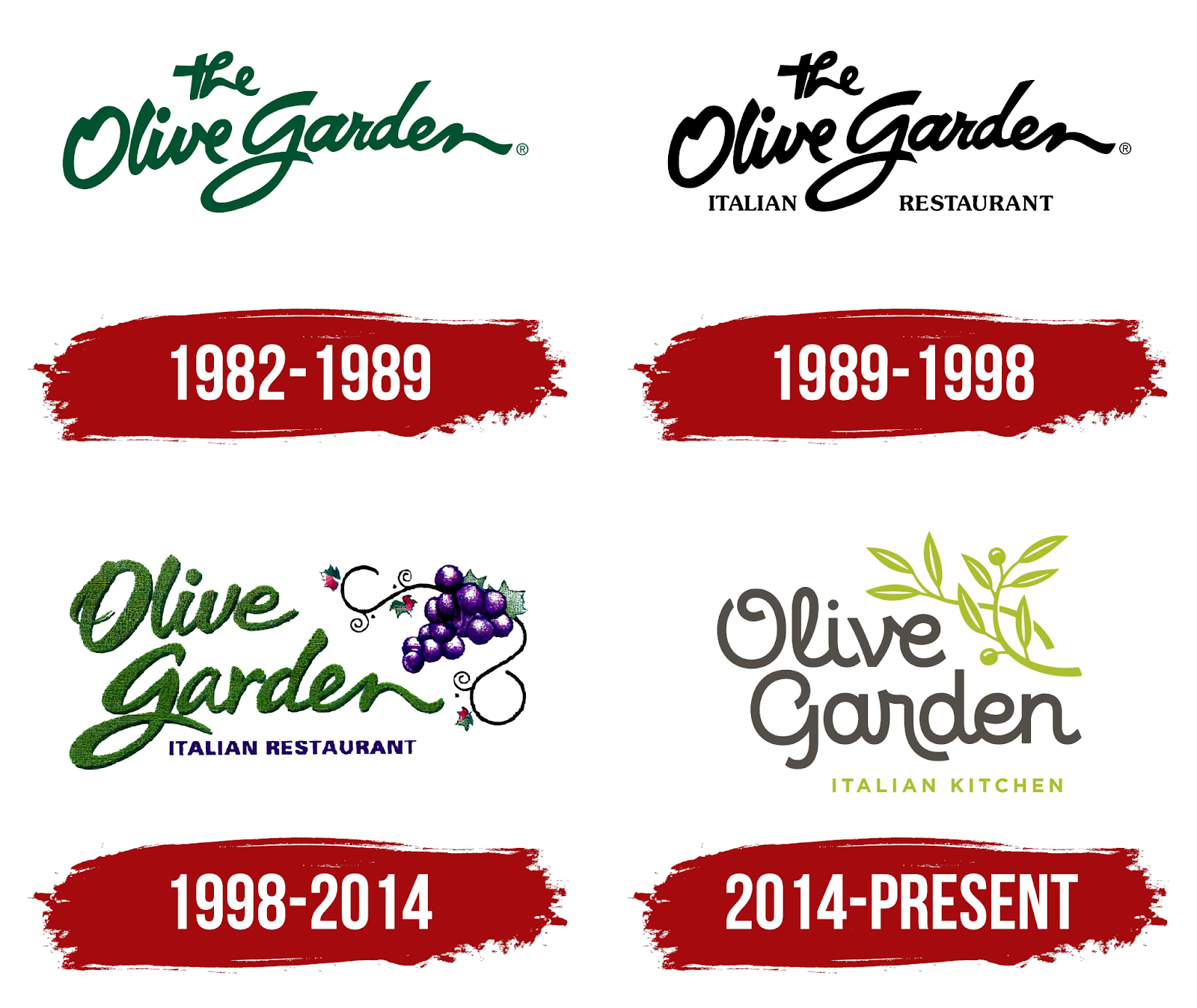
Olive Garden
Over the last forty-plus years of business, Olive Garden has only had four logo changes. While the most recent change has been the largest one, the logo is still very similar to what they started with.
For the better part of thirty-five years, Olive Garden stayed with the same logo font, a very scripty, handwritten one. On their newest change, they edit it to look a little bit more sleek and modern, evening out the width of the letters and simplifying the shapes.
The latest change also changed their subtitle from ‘Italian Restaurant’ to ‘Italian Kitchen’. Other changes in this newest update also include changing the logo icon and the color scheme.
Olive Garden’s very limited changes are a lot more common behavior for companies to follow. Staying consistent so that consumers know what to expect and look for is a safe road to follow, as long as your logo still represents you.
Olive Garden’s newest update shows more of a move to be more modern and inclusive. The color changes are lighter overall as they try to improve how their logo represents them.
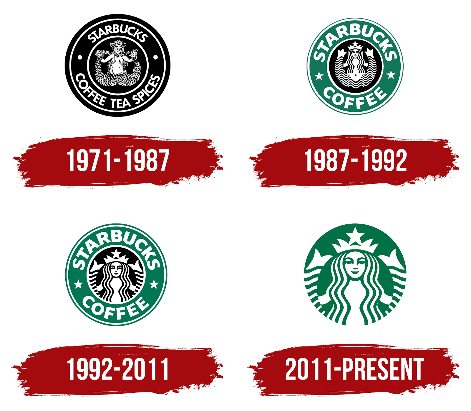
Starbucks
Starbucks is a company that has changed its logo very few times in the last fifty-plus years as well. Their most recent change was to take out their company name, focusing more on the icon only by just having the center circle. They also changed the icon’s colors to be the green and white that had most recently been the outer circle.
These newest changes to their emblem were definitely moves to make the logo look more modern. Simplifying the logo down to the center circle really simplified the design, narrowing it in on the most unique part.
Changing the color of their female icon was a good choice as well. This allowed their more recognizable colors to still represent them, even though they took out the part of the design that commonly featured them.
With their branding and company being such a recognizable name, they no longer needed their own name featured with their logo, such as with the Apple logo. Looking from their original logo to today, their company has come a long way and they continue to make changes to adapt and stay relevant.
Logo Refresh
All of the previous logo changes were major logo redesigns over the years, changing important features that were once the cornerstones of the design. Logo refreshes, however, are more on the subtle side.
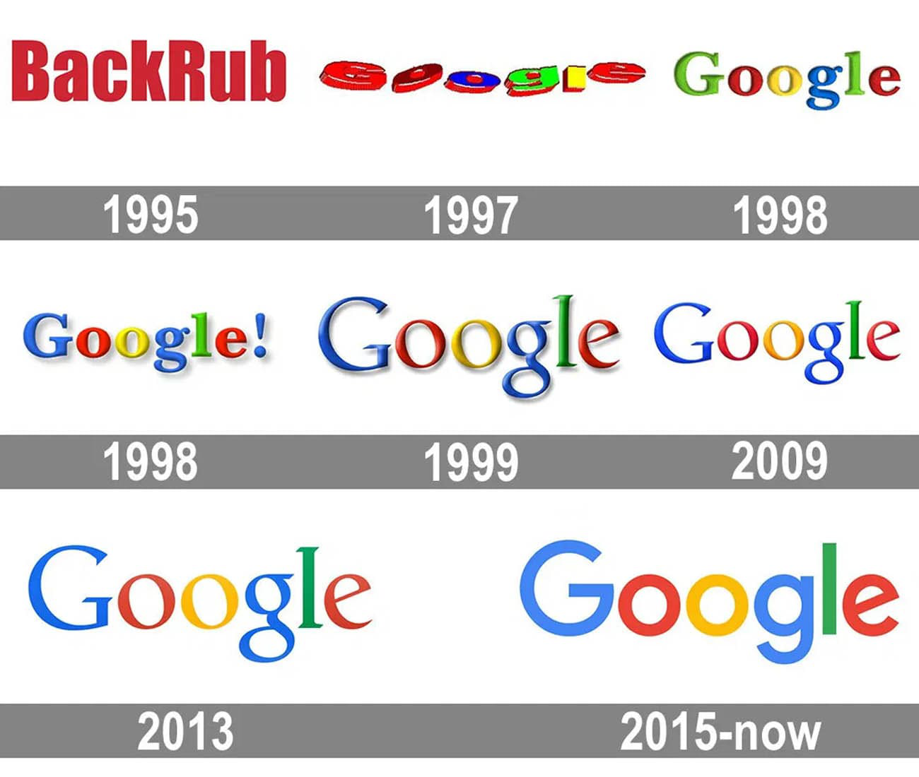
Google is one of the companies that, other than their first three years of life, have only made refreshes to their logo. They have kept very consistent with their logo layout and their colors.
The most major change that they have had is that seven years ago they changed their logo font from a serif font to a sans serif font. Their change was one to keep their company moving forward, projecting themselves as more modern and deeply connected to the world of technology.
Any future changes are likely to also be small as they haven’t had a major redesign since the beginning of their history. But they now have been around for over twenty years, so possibly there is a major redesign on the horizon.
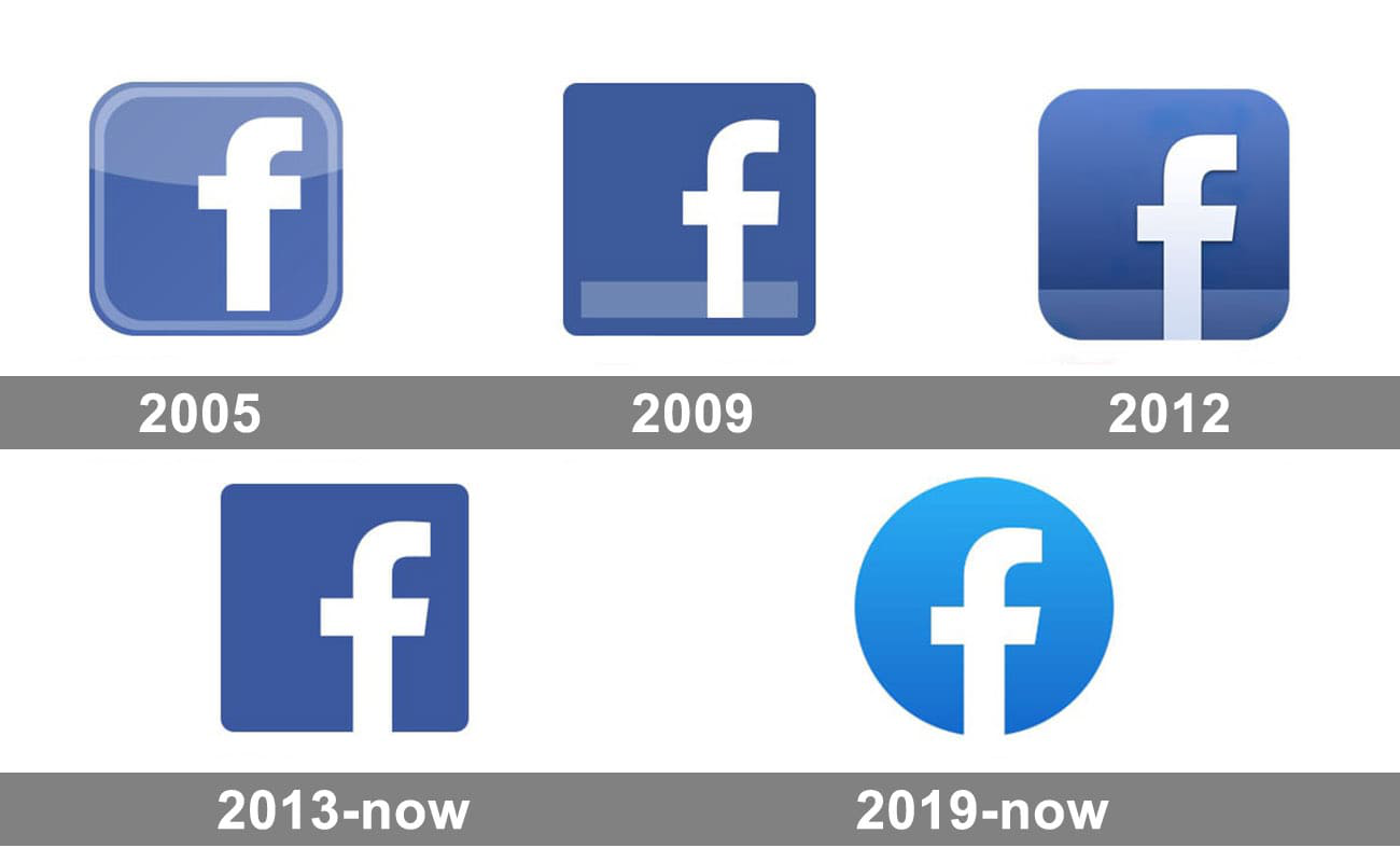
Facebook is another company that has only refreshed its logo since they have been around. They have kept consistent colors, and font of their ‘f’ as well as the overall feel of the icon.
The most significant change that has taken place was recent and that was to change the container shape from a square to a circle and to lighten up its blue color. Prior to this, the company only changed the sheen that was on the logo.
This move might have been so that their logo represented the profile images on their site. Even with this change, the logo still remains a very good shape for an icon and it retains its recognizable features.
All of these changes only take into account how the Facebook logo has evolved and does not delve into the fact that Facebook officially changed to Meta.

Discord
Our last example of a company that has stuck with just refreshing its logo is Discord. In its small life of only seven years, it has only made one change.
The change that the company decided to make consisted of a few things. The icon was simplified down to only include the character, rather than the text box around it. This character was also changed to the company blue color. The Disord name was also edited into a different font.
The original font had built-in corners to help connect it with the text box. But when the text box was taken away, those shapes were no longer needed. So, the company pivoted to a different sans serif font that they felt worked better.
The changes easily simplified the logo, making it easier to look at and understand. Possibly even easier to recognize. The company kept the things that they thought mattered which allows the different logos to still look so similar.

Why Redesign or Refresh your Logo?
Now that you have seen some examples of companies that have redesigned or refreshed their logo, you can consider why you might be interested in doing that to your own logo. The main overarching reason is that a change was needed.
Your Company Has Changed
Is your company the thing that has changed? A good reason to redesign or refresh your logo is that it no longer represents your company well. For a lot of companies, they have to make a change because their current logo no longer reaches the target audience.
-
Target Audience
If you want to reach older generations or have a more classical and regal feel for your logo, your design probably won’t change much. But if your target audience is the younger generation, you will probably have to continue to make updates throughout the life of your company.
Younger crowds seem to want simplified items that are easy and quick to understand. That is the major reason that many logos become more simplified or changed into sans serif fonts.
-
Market
Possibly the thing in your company that has changed is your market. Not all companies stick with the market that they started in. A lot of companies end up expanding or having to pivot to a new market entirely based upon unforeseen changes.
Amazon is a good example of this. They started out just selling books and now they sell everything, as well as they are a platform for individuals to sell through. Just because your company starts selling in a specific market doesn’t mean that they have to stay there.
-
Ideals
It is possible that your icon needs to be changed because your ideals or something else within the company has changed. Perhaps you had some symbols or words in your logo that you feel don’t fit your company well anymore.
Thankfully, you can change these things. We live in an ever-evolving world and it’s possible that your company is going to evolve as well. Thankfully, your logo can continue to evolve as well.
-
Simple Rebranding
The last reason that a change within your company means changing your logo is if you are rebranding. Perhaps your company was bought out by a larger company or you combined with a different company. No matter the reason, changing your colors, icons, or name is very common because of this.
It is important that your logo represents your company well so as your company changes, you need to make sure that your logo continues evolving in the way that represents your company best. This could mean simple changes or complete rebranding.
The World Has Changed
Another major reason that you might need to change your logo is that something in the world has changed. This category is a lot more ambiguous. World changes are extremely hard to predict but if something happens that negatively affects your logo, you are probably going to want to change it.
Some examples could be if a symbol on your logo adopts a new meaning within your culture, and that meaning is not something that you want your company associated with, you will probably need to change it.
Maybe your colors are being used by a different group or something similar. Any changes like this need to be address within your company because if they do harm to you, you would try to offset that harm. Some simple changes you could make would be to change your colors, and font, or to even emphasize a different part of your logo.
How to Change Your Logo
The reason why you are changing your logo should help you determine what about it needs to change. You will have to use your best judgment to make that decision.
Sometimes companies make a bad call when redesigning their logo. They could face backlash from their consumers and ultimately, a loss of business. This is why it is important to think through what you want to change and make the best decision possible.
Another pitfall to avoid is making sure that your logo doesn’t have any double meanings that you don’t intend. Consumers should only be able to see what you want them to when they look at your logo. A good way to avoid this mistake is to have a lot of people look at your work-in-progress design to make sure that you don’t miss anything.
Here are some ways that you can change your logo.
- Changing colors
- Changing fonts
- Changing emblem shape
- Changing icon
- Changing a small detail
When you make a change to your logo, it is important to keep in mind how well your old logo has been doing. If your older logo is still doing well and you just want to update your branding to fit more with the times, you are going to want to try to keep important aspects of your logo very similar.
As was mentioned previously in this article, people don’t like change. If you change too many of the things that they enjoy about your logo, they aren’t going to be happy. If your old logo already works, try to not change too much about the design.
If you want to change the color, then keep the shape and layout the shape. If you want to change the layout or icon, then keep the colors and fonts the same. Too many changes can be too chaotic.
The only reason that you might want to make major changes to your logo is if it really isn’t working well. If your logo isn’t recognizable, is too complicated, or was poorly received, then it would be a positive move to change it up a lot. Check out the Apple logo timeline below.
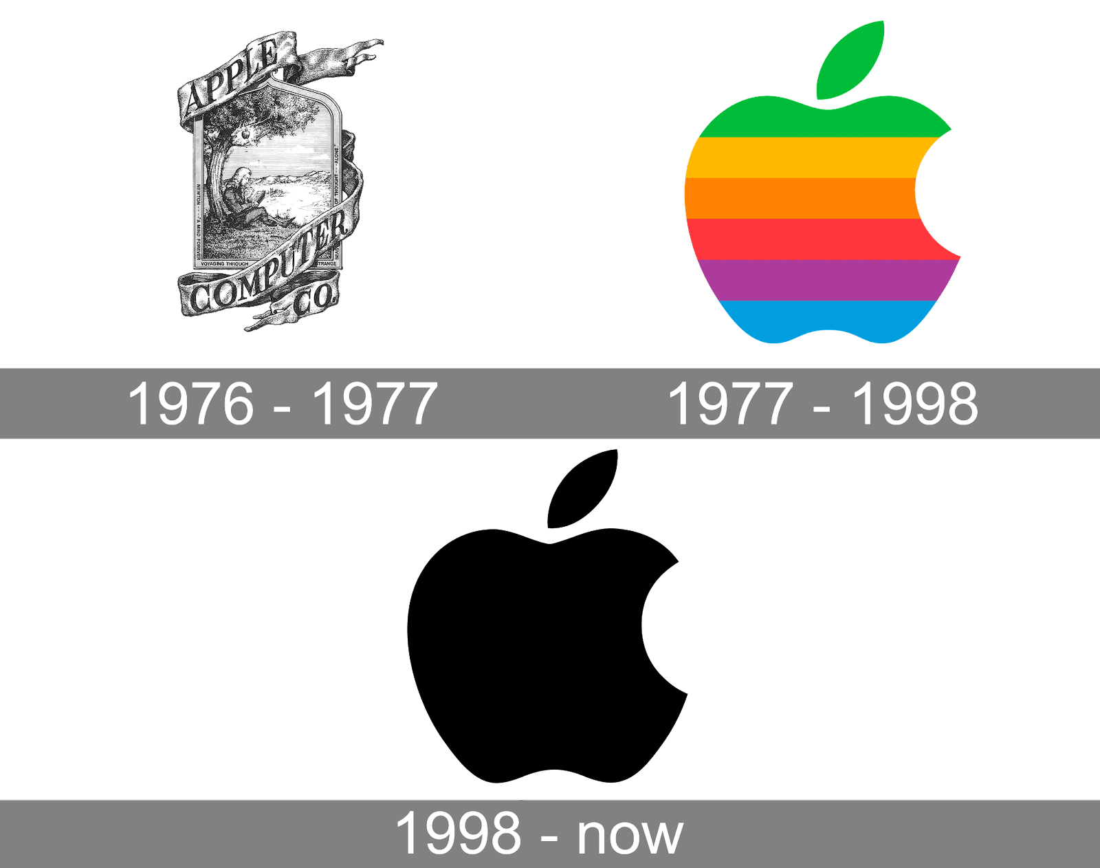
Apple has made very few redesigns throughout the years, but the change from its first logo to its most recent is incredible. The company started out with a very complex portrait that is nice to look at but doesn’t make for a memorable logo.
Their company figured this out pretty quickly and made the fast change to the simple apple outline that we all know and love. This change had such a significant impact that the only thing that has been edited since then is the color of the apple.
How you change your logo, and to what degree, is up to you but make sure to take into account all the factors that are in play.
Start Designing
Know that you know all about logo redesigns and have seen some examples, it’s time to get started. If you already have a preferred program to use, then edit through that. If not, you can check out our logo creator.
LogoCreator is a cost-effective program that is easy to use and extremely quick. In just a few steps, you can have your very own redesigned logo and download it for free. Try out logo creator today.
Angela Irwin is a branding and design enthusiast with a Bachelor of Fine Arts in Graphic Design from Meadowbrook College. As a writer at Logocreator.io, she shares her expertise on logo design, graphic trends, and effective branding strategies, helping businesses create impactful visual identities.