Are you a fan of Baskin-Robbins ice cream? If so, you may have noticed some changes to the brand’s logo, employee uniforms, and packaging. The iconic ice cream chain, which has been in business for 77 years, recently updated its branding to give it a more modern and fresh look.
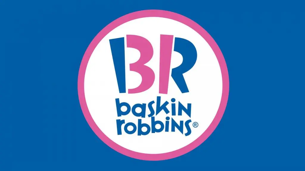
The new logo still features the brand’s signature pink and blue colors, but with a more streamlined and simplified design. The pink parts of the “B” and “R” letters are still used to create the number “31”, which represents the brand’s famous 31 flavors. However, the new logo has a more contemporary font and a more minimalist approach, making it more visually appealing and easier to recognize.
But why did Baskin-Robbins decide to change its logo after all these years? The brand wanted to update its image and appeal to a younger generation of ice cream lovers. The new logo is part of a broader effort to modernize the brand and stay relevant in a competitive market. Baskin-Robbins hopes that the updated branding will attract new customers while still keeping its loyal fans happy.
History of the Baskin-Robbins Logo
Baskin-Robbins is a popular ice cream chain that has been serving delicious ice cream flavors since 1945. The company’s logo has undergone several changes over the years, reflecting the changes in the company’s branding and marketing strategies. In this section, we will take a look at the history of the Baskin-Robbins logo.
Initial Designs
The first Baskin-Robbins logo was designed in 1953 by Carson Roberts, who was also responsible for recommending that Burt Baskin and Irv Robbins merge their businesses. The original logo featured a simple design with the words “Baskin-Robbins” written in a bold, sans-serif font. The logo also included an image of a pink spoon, which is still a recognizable symbol of the brand today.
Logo Evolution
Over the years, the Baskin-Robbins logo has undergone several changes. In the 1960s and 1970s, the logo featured a playful font with creatively designed letters that resembled scoops of ice cream. The logo also featured a pink and brown color scheme, which was associated with happiness, sweetness, and playfulness.
In the 1990s, the company decided to modernize its logo. Designers used the number “31” as the basis for the new logo, which was placed in the center of the logo between the words “Baskin” and “Robbins.” The solid circle was removed, and a half ring was added to the logo.
In 2020, Baskin-Robbins unveiled a new logo designed by Jones Knowles Ritchie’s (JKR) Rob Clarke. The new logo features a more modern and streamlined design, with the words “Baskin-Robbins” written in a bold, sans-serif font. The logo also includes a stylized “BR” monogram, which is meant to represent the company’s commitment to creativity and innovation.
Overall, the Baskin-Robbins logo has evolved over the years to reflect the company’s changing branding and marketing strategies. Today, the logo is a recognizable symbol of the brand, and it continues to be an important part of the company’s identity.
Symbolism in the Baskin-Robbins Logo
When you first look at the Baskin-Robbins logo, you may see a simple design with the company’s name in blue and pink. However, there is more to the logo than meets the eye. Here are some of the symbolic elements that make up the Baskin-Robbins logo:
- 31: The pink part of the letters “B” and “R” in the logo form the number “31,” which is the number of flavors that Baskin-Robbins originally offered. This number has become a significant part of the company’s branding and is still used in their logo today.
- Pink and Blue: The pink and blue colors in the logo represent the company’s focus on fun and enjoyment. Pink is often associated with sweetness and happiness, while blue is associated with calmness and trust. Together, they create a balanced and inviting image.
- Cursive Font: The cursive font used in the logo adds a touch of elegance and sophistication to the design. It also gives the impression of movement and fluidity, which is appropriate for a company that sells ice cream.
- Circular Shape: The circular shape of the logo is both visually appealing and symbolic. Circles are often associated with unity, completeness, and harmony, which are all values that Baskin-Robbins strives to embody.
Overall, the Baskin-Robbins logo is a clever and well-designed representation of the company’s values and mission. By incorporating symbolic elements like the number 31, the pink and blue colors, the cursive font, and the circular shape, the logo effectively communicates the company’s focus on fun, enjoyment, and unity.
Impact of the Baskin-Robbins Logo
Baskin-Robbins is a popular ice cream chain known for its 31 flavors of ice cream and pink spoons. The company’s logo has played a significant role in the success of the brand. In this section, we will explore the impact of the Baskin-Robbins logo on the brand’s recognition and marketing strategy.
Brand Recognition
The Baskin-Robbins logo is easily recognizable, thanks to its unique design and bright colors. The logo features the number 31 in pink, which represents the number of flavors the brand offers. The logo is simple yet eye-catching, making it easy for customers to identify the brand.
The logo has become synonymous with the Baskin-Robbins brand, and it is hard to imagine the brand without it. The logo has been used consistently since the company’s inception in 1945 and has become a part of the brand’s identity.
Marketing Strategy
The Baskin-Robbins logo has been an essential part of the brand’s marketing strategy. The logo is used on all the brand’s products, from ice cream tubs to employee uniforms. The consistency in branding has helped the brand to establish a strong presence in the market.
The brand has also used the logo in its marketing campaigns. The logo has been featured in various commercials and print ads, making it more recognizable to customers. The brand’s marketing strategy has been focused on promoting the variety of flavors the brand offers, and the logo has played a crucial role in this strategy.
In conclusion, the Baskin-Robbins logo has had a significant impact on the brand’s recognition and marketing strategy. The logo’s unique design and bright colors have made it easily recognizable, and its consistency in branding has helped the brand establish a strong presence in the market. The logo has become a part of the brand’s identity and has played a crucial role in the brand’s success.
Modern Interpretation of the Baskin-Robbins Logo
You may have noticed that Baskin-Robbins has changed its logo several times over the years. The most recent update was in 2019, when the company unveiled a modern interpretation of its iconic logo. Let’s take a closer look at what has changed.
The Color Scheme
One of the most noticeable changes in the new Baskin-Robbins logo is the color scheme. While the classic logo featured a pink and brown color scheme, the new logo features a bright pink and blue color scheme. This color scheme is meant to be more modern and appealing to younger generations.
The Typography
Another major change in the new logo is the typography. The classic logo featured a playful font that resembled scoops of ice cream. The new logo, on the other hand, features a more modern and streamlined font. The letters are more evenly spaced and the word “Baskin-Robbins” is now all in lowercase letters.
The Design
The new Baskin-Robbins logo is more streamlined and simplified than the classic logo. The number “31” is still present, but it is now integrated into the “BR” monogram. The monogram is also more abstract than the classic logo, with the “B” and “R” letters merging together to form a single shape.
Overall, the new Baskin-Robbins logo is a modern interpretation of the classic logo. It is more streamlined and simplified, with a brighter color scheme and a more modern font. The new logo is meant to appeal to younger generations while still maintaining the brand’s iconic status.
Comparative Analysis
Comparison with Competitors’ Logos
When it comes to ice cream brands, Baskin-Robbins is one of the most recognizable names in the industry. Their logo, which features the number 31 in pink and blue, is a significant part of their brand identity. But how does it compare to the logos of their competitors?
One of Baskin-Robbins’ biggest competitors is Dairy Queen. Dairy Queen’s logo features a stylized image of a dairy cow and the brand name in blue and red. While both logos use bright colors, Baskin-Robbins’ logo is more minimalist and modern, while Dairy Queen’s logo has a more classic, traditional feel.
Another competitor is Ben & Jerry’s, whose logo features a cartoon image of the founders and the brand name in bold, colorful letters. Compared to Baskin-Robbins’ logo, Ben & Jerry’s logo is more playful and whimsical, which reflects the brand’s commitment to fun and creativity.
Public Perception
Public perception is an essential factor to consider when analyzing a logo’s effectiveness. Baskin-Robbins’ logo has been around since the 1950s and has undergone several changes throughout the years. However, the current logo, which features the number 31, has become synonymous with the brand and is easily recognizable by consumers.
According to a recent survey, Baskin-Robbins’ logo is one of the most recognizable logos in the ice cream industry. The survey found that 78% of respondents could correctly identify the Baskin-Robbins logo, compared to 67% for Dairy Queen and 56% for Ben & Jerry’s.
Overall, Baskin-Robbins’ logo is a strong representation of the brand’s identity and has proven to be effective in building brand recognition and loyalty among consumers.
Future of the Baskin-Robbins Logo
As we move forward, Baskin-Robbins has shown that they are not afraid to update and refresh their logo. With the recent 2022 rebrand, we can expect that the Baskin-Robbins logo will continue to evolve to stay relevant in the ever-changing market.
One potential direction for the logo could be a shift towards a more minimalist design. Many companies have been moving towards simple and clean logos, and Baskin-Robbins may follow suit. This could involve removing some of the intricate details in the logo and focusing on the brand’s iconic 31 flavors.
Another possibility is incorporating more vibrant colors into the logo. The current logo features a muted brown color, but Baskin-Robbins could choose to bring back the brighter pinks and blues from previous iterations. This would help the logo stand out and catch the eye of potential customers.
In addition to the logo itself, Baskin-Robbins may also explore new ways to incorporate their branding into their products and stores. This could include branded merchandise or unique packaging for their ice cream.
Overall, the future of the Baskin-Robbins logo looks bright and exciting. As the company continues to innovate and adapt, we can expect to see even more changes to their branding in the years to come.
Barry Edwards is a digital marketing expert with a deep understanding of content strategy, logo, and branding principles. Holding a Bachelor’s degree in Marketing from Beaconhill College, he offers valuable insights on digital marketing trends and strategies through his writing. Follow Barry’s work to stay updated on the latest in online marketing and branding.