Are you aware that colors have the power to evoke emotions and influence our behavior? From the clothes we wear to the products we buy, colors play a significant role in our decision-making process. This is why businesses carefully choose the colors they use in their branding, particularly their logo design. In fact, the color of a logo can make or break a brand’s success.
Have you ever wondered why some logos use certain colors? For instance, why do fast-food chains like McDonald’s and KFC use red and yellow in their logos? Or why do tech giants like Apple and IBM use blue? It turns out that colors have psychological associations that can impact how we perceive a brand. Understanding the psychology of color can help businesses choose the right colors for their logo design, which can ultimately influence their target audience’s emotions and behavior. In this article, we’ll explore the relationship between colors, emotions, and logo design, and how businesses can use this knowledge to create a successful brand.
Understanding Colours and Emotions
Psychology of Colours
Colours are powerful tools that can evoke a wide range of emotions. They can influence our mood, behavior, and even our purchasing decisions. Understanding the psychology of colours is essential for effective logo design. Here are a few commonly associated emotions with different colours:
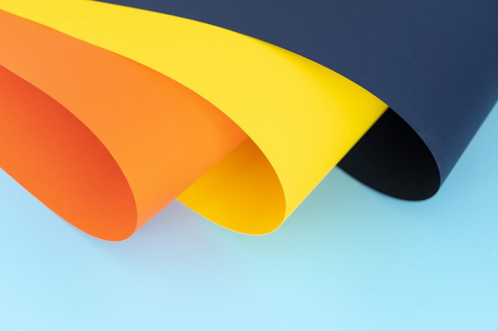
- Red: This colour is often associated with passion, love, and excitement. It can also signify danger, anger, and aggression.
- Blue: Blue is a calming, peaceful colour. It is often associated with trust, loyalty, and intelligence. However, it can also evoke feelings of sadness and depression.
- Green: Green is a colour of growth, renewal, and nature. It can also represent envy and greed.
- Yellow: This colour is often associated with happiness, optimism, and warmth. However, it can also signify caution and cowardice.
- Purple: Purple is a regal, luxurious colour. It can also represent creativity and spirituality. However, it can also be associated with mourning and sadness.
- Orange: Orange is a vibrant, energetic colour. It can evoke feelings of excitement, enthusiasm, and warmth. However, it can also be associated with aggression and danger.
Colour Emotions in Different Cultures
It’s important to keep in mind that different cultures can have different associations with colours. For example, in Western cultures, white is often associated with purity and innocence. However, in some Eastern cultures, white can be associated with death and mourning. Similarly, in Western cultures, black is often associated with mourning and sadness. However, in some African cultures, black is associated with strength and power.
When designing a logo for a global brand, it’s important to consider the cultural associations with different colours. A colour that evokes positive emotions in one culture may have a negative connotation in another. Therefore, it’s essential to research the cultural associations with different colours before finalizing a logo design.
In conclusion, understanding the psychology of colours and their cultural associations is crucial for effective logo design. By choosing the right colours, you can evoke the desired emotions and create a strong brand identity.
Role of Colours in Logo Design
When it comes to designing a logo, choosing the right colours is crucial. Colours can evoke emotions, convey messages, and influence consumer behaviour. In this section, we’ll explore the role of colours in logo design.
Choosing the Right Colours
Choosing the right colours for your logo is important because it can affect how people perceive your brand. Here are some things to consider when choosing colours for your logo:
- Colour Psychology: Colours can evoke different emotions and feelings. For example, blue is often associated with trust and reliability, while red is associated with passion and excitement. Consider what emotions you want your logo to convey and choose colours accordingly.
- Brand Personality: Your logo should reflect your brand’s personality. If your brand is playful and fun, you might want to use bright, bold colours. If your brand is more serious and professional, you might want to use more muted colours.
- Colour Combinations: Consider how different colours work together. Some colours look great together, while others clash. Use a colour wheel to find complementary colours that work well together.
Impact of Colour Choices
The colours you choose for your logo can have a significant impact on how people perceive your brand. Here are some ways that colour can affect consumer behaviour:
- Brand Recognition: Using consistent colours in your logo can help improve brand recognition. When people see your logo, they’ll associate it with your brand and the emotions it evokes.
- Consumer Behaviour: Colours can influence consumer behaviour. For example, red is often used in sales and promotions because it creates a sense of urgency and excitement. Green is often associated with eco-friendliness and sustainability.
- Brand Differentiation: Using unique colours in your logo can help your brand stand out from competitors. If all your competitors are using blue, consider using a different colour to differentiate your brand.
In conclusion, choosing the right colours for your logo is important because it can affect how people perceive your brand. Consider colour psychology, your brand’s personality, and colour combinations when designing your logo. The colours you choose can impact brand recognition, consumer behaviour, and brand differentiation.
Case Studies of Colour Emotions in Logo Design
Color is a powerful tool that can evoke emotions, shape perceptions, and influence user behavior. It is no wonder that businesses place so much emphasis on choosing the right colors for their logos. In this section, we will explore some case studies of color emotions in logo design.
Successful Colour Choices
McDonald’s – Yellow and Red
McDonald’s is one of the most recognizable brands in the world, and its logo is a prime example of the power of color. The company’s logo features bright yellow arches against a red background. Yellow is associated with happiness, positivity, and optimism, while red is associated with passion, energy, and excitement. Together, these colors create a logo that is both eye-catching and cheerful, which is perfect for a fast-food restaurant.
Coca-Cola – Red and White
Coca-Cola is another iconic brand that has used color to its advantage. The company’s logo features a red background with white lettering. Red is associated with passion, energy, and excitement, while white is associated with purity and simplicity. Together, these colors create a logo that is both bold and timeless.
Colour Mistakes to Avoid
BP – Green and Yellow
In 2000, BP rebranded with a new logo featuring a green and yellow sunburst. While green is often associated with nature and the environment, the use of yellow in this logo was a mistake. Yellow is associated with caution and warning, which is not a message that BP wanted to convey. Unfortunately, the logo became associated with the company’s environmental disasters, and BP was forced to rebrand again in 2010.
Tropicana – Orange and Green
In 2009, Tropicana rebranded with a new logo featuring an orange and green straw sticking out of an orange. While orange is associated with warmth and friendliness, the use of green in this logo was a mistake. Green is associated with nature and health, which is not a message that Tropicana wanted to convey. Unfortunately, consumers found the new logo confusing and sales dropped by 20%. Tropicana was forced to revert to its old logo.
In conclusion, color is a powerful tool that can make or break a logo. By choosing the right colors, businesses can create logos that are both memorable and effective. However, it is important to avoid color mistakes that can send the wrong message to consumers.
Future Trends in Colour and Logo Design
As we move towards the future, the world of design is constantly evolving. With technological advancements and changing consumer preferences, it’s important for businesses to stay up-to-date with the latest trends in colour and logo design. Here are some emerging trends that you should keep in mind:
Influence of Technology on Colour Choices
Technology has a significant impact on the way we perceive colours. With the rise of digital media, colours can appear differently on different screens and devices. This has led to the emergence of new colour palettes that are optimized for digital media.
One trend that we are seeing is the use of bright and bold colours that stand out on digital platforms. These colours are often used in contrast with more muted tones to create a dynamic and eye-catching design. Another trend is the use of gradients and overlays to create depth and texture within a design.
Emerging Colour Trends
Colour trends are constantly evolving, and it’s important to stay ahead of the curve. Here are some emerging colour trends that you should keep in mind:
- Earthy Tones: Colours inspired by nature, such as greens, browns, and blues, are becoming increasingly popular. These colours evoke a sense of calm and tranquility, making them perfect for brands that want to promote a natural and sustainable image.
- Neons: Bright and bold neon colours are making a comeback. These colours are often used in contrast with black or white to create a striking and modern design.
- Metallics: Metallic colours, such as gold, silver, and bronze, are becoming increasingly popular in logo design. These colours add a touch of luxury and sophistication to a design, making them perfect for high-end brands.
In conclusion, staying up-to-date with the latest trends in colour and logo design is essential for businesses that want to stay relevant in today’s fast-paced world. By incorporating these emerging trends into your designs, you can create a brand image that is modern, dynamic, and eye-catching.
Angela Irwin is a branding and design enthusiast with a Bachelor of Fine Arts in Graphic Design from Meadowbrook College. As a writer at Logocreator.io, she shares her expertise on logo design, graphic trends, and effective branding strategies, helping businesses create impactful visual identities.


