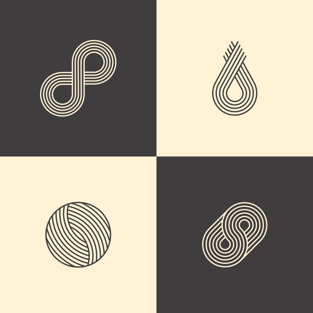
Taking the best of what worked in the past and making it better is what makes modern logos so effective. They also add a sense of newness and employ new techniques or ways of doing things.
Modern logos don’t have to be created new. You can modernize any existing logo by making sure that it holds all the qualities of a modern logo.
Companies that do modernize their logo do so around every ten years with some companies changing their logo more frequently and others less so.
If you are having trouble deciding if your logo meets these traits, you can always ask your consumers what they think. If you are still having a hard time getting feedback, try to talk with the youngest generation in the workforce, they will have the freshest views on design.
No matter if you are updating an old logo or creating a new logo, you’ll want to make sure that it has the following traits to be as modern as possible.
Simplicity Within Modern Logos
A modern logo is simple. Logos of the past were often cluttered with a lot of different elements and words that really made the composition more clustered.
Having just a few elements can help streamline your logo, making it easier to read and understand as well as recognize.
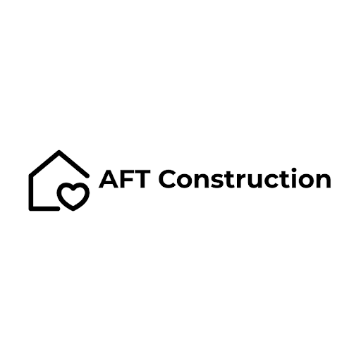
In the example above for AFT Construction, they have a logo of a house with a heart holding up one of the ends. They are made out of simple lines, and yet the image is still impactful.
While the heart is fully intact, the house shape could be considered abstract due to the incomplete form. They only use one color and it matches the name of the company making it a very simple design.
Having a simple design can be one of the very best ways to communicate with your viewers about your modern company. Narrowing down your message to just a few elements can be super beneficial.
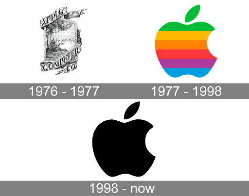
One example to explore this idea comes from Apple’s logo. When their company was first started, it had a more complex logo. But throughout the years, it changed into what we now know of as the apple symbol.
Large compositions may look nice or have neat easter eggs in them, but they just aren’t as effective as an icon. You don’t need an entire painting to represent your company.
Larger and more complex logos can be harder to scale down because the image is so complex. All the elements may not look so good when shrunken down and squished together.
Having a simple logo has actual benefits as well as it helps modernize the logo and helps it appeal more to younger generations.
Typography Within Modern Logos
The type of typography that you choose can influence how modern your logo becomes. Making a decision to only utilize certain types of fonts can help with this for your logo.
- Sans serif fonts are the best for logos that appear to be modern. They are sleek, easy to read, and easy to resize.
- If you want your logo to appear more traditional or older, a serif font is a good choice. These fonts are reminiscent of calligraphy writing as opposed to letters that are typed.
- Some script fonts can also appear to be more modern, but not all of them fall into this category. Because script fonts are so unique, their level of modernness is based more on viewers’ opinions and aren’t as easily categorized.
In the example above for The Green Tea, the logo utilizes a sans serif font. This helps it look more modern as opposed to using a serif font.
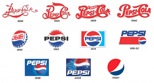
One company that has played around with typography over the years is Pepsi. They originally started out with a more scripted font. It is more reminiscent of a serif font in its original years.
As time goes by, however, the font ends up becoming more modernized and stays that way, keeping up the sans serif appearance. This is one of the changes that has helped their company modernize their font, among others.
By utilizing the right kind of typography, you can drastically affect how modern your logo is. Even if your company originally starts off with something different, you are still able to change and make a more modern logo.
Hand-drawn elements Within Modern Logos
One item that really increases the modernness of logos is having a hand-drawn element in them. With the use of computer programs, many logos have become fully digitized. While this was originally very neat, it has become overused as these perfect, flawless computer images flood the market.
A great way to make your logo feel more modern is to add some unique hand-drawn touches. Adding a simple sketched outline or maybe some shaded marks can help your logo become more modern than ever.
In the example used above, the logo is made through a digital program, but the design for Daily Art has a hand-drawn feeling to it that helps give it a more modern impression.
One company that started strong in the hand-drawn game was Disney. Basing their logo off of Walt Disney’s signature was a very bold move that majorly paid off for them.
However, over the years, Walt’s signature has become more stylized and less realistic. After digitizing his name, they slowly worked their way to where they are today with just Disney, and the castle, as the logo.
Despite the fact that they digitized his signature and made it into its own font, it still retains its uniqueness from having been an original hand-drawn element.
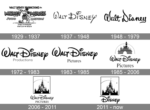
The hand-drawn element within your design doesn’t have to be much in order to have a large impact on the modernness of your logo. Add a small element to your logo today to see its impact.
Geometric Shapes and Patterns Within Modern Logos
You can use shapes within your logo design to affect how modern they feel. Different shapes have different psychologies behind them and can influence viewers’ feelings about your logo.
Make sure that the shapes you use are helpful to your overall branding and message. Using simple shapes and patterns in smart ways within your logo can increase the modernness of your logo.
- Circles and ovals are never-ending shapes that have no angles and are related to the planets and sun. Their main elements are stability, eternity, and mystery.
- Squares and rectangles are strong and able to hold a lot of weight. Their main traits relate to security, reliability, and discipline.
- Triangles are shapes that call the viewer to action. Their main traits are movement, energy, and stability.
- Abstract shapes are very unique and one of a kind. They have elements of representing, stylization, and power.
- Organic shapes are very natural. Their traits are comforting, flexible, and realistic.
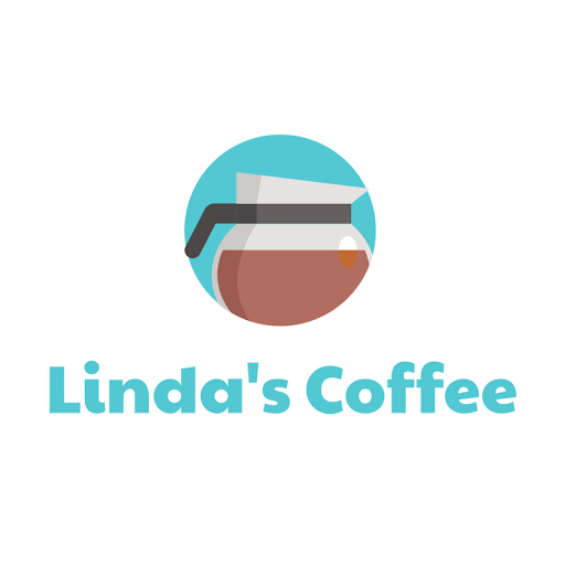
The example above utilizes a variety of shapes but it most heavily depends on the circle. Linda’s Coffee is represented by the overall circular container that matches the circle of the coffee pot. The other shapes added help so that the viewer is able to understand what the subject matter of the icon is.
While there are multiple shapes and colors used within the design, it still remains very simple in its depiction of the coffee container.
Using shapes to create patterns within your logo can be very effective. Even for Linda’s Coffee, just having multiple circles begins that pattern.
Once you decide on a shape, it is important to continue using it and carry it through onto other marketing material for your company. This will create consistency and add more power to your modern logo.
One company that experimented with shapes was Starbucks Coffee. Originally they had a hand-drawn design. Soon after that though, they changed it to the more familiar design that we currently know.
Adding to their female character, they put some circles into their design and from then forward, haven’t looked back. Every change since then has been a simplification of the female character and a strengthening of the circle shape.
They keep this modern circle logo consistent throughout their marketing.
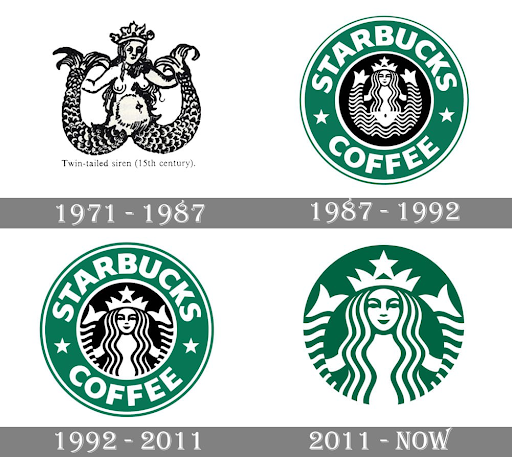
Having a shape that you can depend on within your logo is very important. It can help you modernize your logo as well as make it memorable to your consumers.
All shapes carry some sort of psychological message so it’s important that your logo is communicating what you want it to for your brand.
Color Choice Within Modern Logos

Colors are very important for relaying information. Great modern logos will use the colors that they choose to their advantage to help better portray their brand.
Most modern colors stick with one primary color and only one or two secondary colors. Very few modern logos have a lot of different colors featured. Using a whole lot of colors effectively can be very difficult to pull off successfully.
When choosing multiple colors, make sure that they work well together and do not negatively effect one another. White, black, and grey all make excellent secondary colors.
Choosing colors that are related to your primary or that are on opposite sides of the spectrum can also be a good decision.
You shouldn’t just decide on a color for your company because you think it looks good. All colors have psychological meanings that they portray which means that choosing the appropriate colors to demonstrate what you want to say is very important.
- Black is a color that holds a lot of mystery. It has values of strength, power, sophistication, elegance, and authority.
- White is an incredibly pure and innocent color. It also has elements of cleanliness, elegance, simplicity, calming, and coldness.
- Grey is a very neutral color. It has values of balance, relaxation, reliableness, soothing, and calming.
- Brown is a very natural color, related to the Earth. It has elements of comforting, honesty, grounding, predictability, and Earthy.
- Red is a very intense color. It has elements of passion, action, danger, excitement, and energy.
- Orange is a very creative color. It has values of enthusiasm, optimism, spontaneity, success, and encouragement.
- Yellow is a very happy color. It has elements of warmth, positivity, and inspiration.
- Pink is a very feminine color. It has ties to love, emotion, kindness, and nurturing.
- Blue is a very trustworthy color. It has elements of security, peace, calmness, predictability, and reliability.
- Green has very close ties to nature and health. It also represents growth, fertility, materialism, prosperity, health, and hope.
- Purple has been revered for a long time as a royal color. It has elements of wisdom, spiritualness, inspiration, and uplifting.
The example displayed above portrays the important use of color for modern logos. Hope for Paws chose to have a pink/red color. This not only ties in well with their heart-shaped paw print but also helps show their connection to the pink and red values that include passion, excitement, energy, action, love, kindness, nurturing, and emotionalness.
One company that has done very well in remaining consistent with its colors throughout the years is Adidas. They have had many design changes to their logo as they decided on font and icon, but one thing that they never changed is their black and white colors.
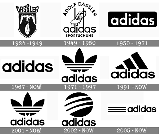
For your own modern logo, in order to choose the best colors, try narrowing down your options based on the traits that you want your company to embody and represent. Once you have it narrowed down, you can choose your colors based on what is best for your brand. Perhaps one color works better for your industry than another.
Modern Logo Design Inspiration
One of the best ways to gain inspiration for your own modern logo design is to look around you. There are plenty of sources for inspiration.
Everything that is living is always adapting and changing. It is in our nature to continue moving and looking for ways make positive changes to the things that we have already established.
Looking online or at the logos that are in use around you is a good way to get started. There are many websites available that focus on logo design and logos that are in use in our world.
Another great way to gain inspiration is to go outside. You can get inspiration for colors, shapes, and more by spending time in the natural world.
Make Your Own Modern Logo
Now that you know what it takes to have a modern logo, you can create your own. Write down some ideas you have for your modern logo or for what changes you want to add to your current logo.
You can start designing your logo once you have an idea in mind. Our logo creator is a great resource to use that is easy to use, and one hundred percent free.
The AFT Construction, The Green Tea, Daily Art, Linda’s Coffee, and Hope for Paws logos were all created through Logo Creator.
Our program doesn’t require any previous knowledge of design or fancy programs that you have to pay for. All you need is the internet to access it and get started.
The first step is to enter the name of your company and any tagline that you want to use. Then choose what category your company best fits in. After that, go through our many designs to find one that works best for you.
In just a few steps, you too can have your own modern logo that fits your neds. We have thousands of designs for you to choose from that utilize good colors, shapes, simplicity, hand-drawn elements, and typography for a modern logo.
Once you have an icon picked, you get to edit everything on our easy-to-use platform. Edit the colors, shapes, typography, and more of your new logo to make it as modern as you would like.
Don’t let anything stand in the way of your new and modern logo. Try out our Logo Creator today to get started.
Barry Edwards is a digital marketing expert with a deep understanding of content strategy, logo, and branding principles. Holding a Bachelor’s degree in Marketing from Beaconhill College, he offers valuable insights on digital marketing trends and strategies through his writing. Follow Barry’s work to stay updated on the latest in online marketing and branding.
