Are you looking to create a fall-inspired logo for your business or brand? Look no further than the fall color palette. With its warm, earthy tones and vibrant hues, the fall color palette is the perfect choice for designing a logo that captures the essence of the season.
When it comes to designing a logo with a fall color palette, there are a few key things to keep in mind. First, consider the colors that are traditionally associated with fall, such as burnt orange, deep red, and golden yellow. These colors can be used individually or combined to create a unique and eye-catching logo. Additionally, think about incorporating elements of nature into your design, such as leaves, acorns, or pumpkins, to further emphasize the fall theme.
By using a fall color palette in your logo design, you can create a visual representation of your brand that is both warm and inviting. Whether you’re designing a logo for a seasonal product or service, or simply want to add a touch of fall to your brand, the fall color palette is a versatile and timeless choice. So why not embrace the beauty of the season and incorporate a fall color palette into your logo design today?
Fall Color Palette: An Overview
As the leaves start to change and the air gets cooler, it’s time to embrace the beautiful colors of fall. Whether you’re designing a logo or creating a marketing campaign, incorporating a fall color palette can bring warmth and depth to your design.
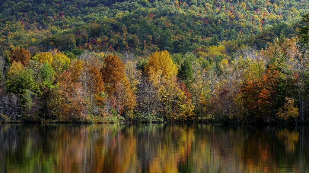
The colors most associated with fall are orange, red, yellow, and brown, inspired by the changing colors of leaves as temperatures drop and daylight shrinks. However, there are many variations of these colors that can be used to create unique and eye-catching designs.
When selecting your fall color palette, consider the emotions and feelings you want to convey. Warm oranges and yellows can evoke feelings of happiness and excitement, while deep burgundies and browns can create a sense of comfort and coziness.
Here are some popular fall color palettes to inspire your designs:
- Warm and Cozy: This palette features rich, earthy tones like rust, mustard, and olive green, paired with warm browns and deep reds. It’s perfect for creating a cozy and inviting atmosphere.
- Vibrant and Bold: If you want to make a statement, consider a palette with bright oranges, yellows, and reds. Add in some deep blues or purples for contrast and balance.
- Neutral and Elegant: For a more sophisticated look, opt for a palette of muted grays, browns, and creams. Add in a pop of burnt orange or deep red for a touch of warmth.
Remember, your fall color palette should complement your brand and the message you want to convey. With the right combination of colors, you can create a design that is both visually appealing and emotionally impactful.
Logo Design Basics
When it comes to designing a logo, there are a few basics that you need to keep in mind. A logo is the face of your brand, so it needs to be unique, memorable, and timeless. Here are some logo design basics that you should consider:
Keep it Simple
Simplicity is key when it comes to logo design. A simple logo is easier to remember and recognize. It also looks better when it’s scaled down, which is important for things like social media profiles and business cards. Avoid using too many colors, fonts, or elements in your logo. Instead, focus on one or two elements that represent your brand.
Choose the Right Colors
Colors play a big role in logo design. They can convey emotions, set the tone, and create a memorable impression. When choosing colors for your logo, consider the psychology behind each color and what it represents. For example, green represents growth and nature, while blue represents trust and professionalism.
Use the Right Fonts
The font you choose for your logo can say a lot about your brand. A serif font can convey tradition and professionalism, while a sans-serif font can be more modern and approachable. Avoid using too many fonts in your logo, and make sure the font is easy to read at different sizes.
Make it Timeless
Your logo should stand the test of time. Avoid using trendy design elements that will quickly become outdated. Instead, focus on creating a logo that is classic and timeless. This will ensure that your logo remains relevant and recognizable for years to come.
By following these logo design basics, you can create a logo that represents your brand and leaves a lasting impression on your audience.
Incorporating Fall Colors into Logo Design
When designing a logo, color is an essential element that can convey the message and personality of a brand. Incorporating fall colors into your logo design can create a warm and inviting aesthetic that resonates with your audience. Here are some tips for incorporating fall colors into your logo design.
Understanding Color Psychology
Before choosing fall colors for your logo, it’s essential to understand color psychology. Colors can evoke emotions and associations, and different colors can have different meanings in different cultures. Here are some common associations with fall colors:
- Orange: warmth, energy, excitement, and friendliness
- Brown: stability, reliability, and earthiness
- Yellow: happiness, optimism, and creativity
- Red: passion, love, and urgency
- Burgundy: sophistication, luxury, and elegance
Choosing the Right Fall Colors
When choosing fall colors for your logo, consider the message and personality you want to convey. Here are some tips for choosing the right fall colors:
- Stick to a limited color palette: Using too many colors can make your logo look cluttered and confusing. Stick to two or three fall colors that complement each other.
- Consider your audience: Different colors can appeal to different demographics. For example, orange and yellow can be attractive to younger audiences, while burgundy and brown can be more appealing to older audiences.
- Use contrast: Make sure your fall colors have enough contrast to be visible and legible, especially when used on different backgrounds.
- Test your colors: Before finalizing your logo design, test your fall colors on different devices and in different lighting conditions to ensure they look good in all situations.
Incorporating fall colors into your logo design can create a warm and inviting aesthetic that resonates with your audience. By understanding color psychology and choosing the right fall colors, you can create a logo that effectively communicates your brand’s message and personality.
Case Studies of Successful Fall Color Logos
Are you looking for inspiration for your fall color logo design? Look no further than these successful case studies of fall-themed logos:
Starbucks
Starbucks’ iconic green and white logo got a fall makeover in 2019 with the addition of a golden-yellow gradient background. This warm color palette evokes the feeling of cozy autumn afternoons spent sipping a pumpkin spice latte.
FedEx
FedEx’s logo features a bold purple and orange color scheme, which is perfect for fall. The contrasting colors create a sense of energy and movement, while the orange adds a touch of warmth and friendliness.
Timberland
Timberland’s logo features a classic brown and yellow color palette, which is a perfect fit for their brand image of rugged outdoor wear. The warm brown evokes the feeling of autumn leaves, while the bright yellow adds a touch of energy and excitement.
The North Face
The North Face’s logo features a simple black and white color scheme, but their fall campaigns often incorporate warm, earthy tones like brown and green. This color palette creates a sense of adventure and exploration, which is perfect for their brand image.
McDonald’s
McDonald’s iconic golden arches are a perfect fit for fall, with their warm, sunny yellow color. This color palette creates a sense of happiness and positivity, which is perfect for a fast food chain that aims to bring joy to their customers.
Whether you’re designing a logo for a coffee shop, outdoor brand, or fast food chain, these successful case studies show that fall color palettes can add warmth, energy, and excitement to your brand image.
Tips and Tricks for Designing with Fall Colors

Fall colors are a great way to add warmth and depth to your logo design. Here are some tips and tricks to help you design a stunning logo using fall colors.
Balancing Colors
When designing with fall colors, it’s important to balance the colors to create a cohesive design. You can do this by choosing a dominant color and using other colors as accents. For example, if you choose a deep red as your dominant color, you can use orange and yellow as accents to create a balanced design.
Using Contrast Effectively
Using contrast is an effective way to make your fall color logo stand out. You can create contrast by using light and dark colors, or by using complementary colors. For example, if you choose a dark brown as your dominant color, you can use a light yellow or orange as an accent to create contrast.
Creating a Versatile Logo
When designing a fall color logo, it’s important to create a versatile logo that can be used on different backgrounds and in different sizes. You can do this by choosing colors that work well on both light and dark backgrounds, and by choosing a simple design that can be easily scaled up or down.
Here are some additional tips for creating a versatile logo:
- Use a simple design with clean lines and minimal details.
- Choose colors that work well on both light and dark backgrounds.
- Use high-contrast colors to make your logo stand out.
- Test your logo in different sizes to ensure it’s readable and recognizable.
By following these tips and tricks, you can design a stunning logo using fall colors that will stand out and make a lasting impression.
Software Tools for Logo Design
When it comes to designing a logo, having the right software can make all the difference. Here are some popular software tools for logo design:
Adobe Illustrator
Adobe Illustrator is a vector graphics editor that is widely used by designers for creating logos. It offers a wide range of tools and features that allow you to create complex shapes, customize typography, and apply various effects to your designs. With its user-friendly interface and powerful capabilities, Adobe Illustrator is a great choice for both beginners and experienced designers.
CorelDraw
CorelDraw is another popular vector graphics editor that is commonly used for logo design. It offers a similar set of features to Adobe Illustrator, including the ability to create complex shapes, customize typography, and apply various effects. One advantage of CorelDraw is that it is often more affordable than Adobe Illustrator, making it a great choice for designers on a budget.
Canva
Canva is a graphic design platform that is popular among small business owners and non-designers. While it may not offer the same level of customization as Adobe Illustrator or CorelDraw, Canva is a great option for creating simple logos quickly and easily. It offers a wide range of templates and design elements that you can use to create a professional-looking logo in minutes.
In summary, Adobe Illustrator and CorelDraw are powerful tools for creating complex logos, while Canva is a great option for creating simple logos quickly and easily. Depending on your budget and level of experience, any of these tools could be a great choice for your logo design project.
Conclusion
Congratulations on making it to the end of this article! You now have a better understanding of how to incorporate fall colors into your logo design and branding. Remember, fall colors are not just limited to oranges and browns. You can also use deep reds, yellows, greens, and even purples to create a warm and inviting aesthetic.
When choosing a fall color palette for your logo and branding, consider your target audience and the message you want to convey. Are you targeting a younger demographic or a more mature audience? Do you want your brand to exude warmth and comfort or sophistication and elegance?
Keep in mind that your fall color palette should be consistent across all your branding materials, including your website, social media, and packaging. This will help create a cohesive and memorable brand identity.
Lastly, don’t be afraid to experiment and have fun with your fall color palette. Use different shades and combinations to create a unique and eye-catching design. With the right fall color palette, your logo and branding will stand out and make a lasting impression on your customers.
Barry Edwards is a digital marketing expert with a deep understanding of content strategy, logo, and branding principles. Holding a Bachelor’s degree in Marketing from Beaconhill College, he offers valuable insights on digital marketing trends and strategies through his writing. Follow Barry’s work to stay updated on the latest in online marketing and branding.


