Are you a food delivery service looking to create a memorable logo that will attract customers? Or maybe you’re just curious about the different types of logos used in the food delivery industry. Either way, you’ve come to the right place! In this article, we’ll be discussing food delivery logos and what makes them effective.
A well-designed food delivery logo can make all the difference in the success of your business. It should be eye-catching, memorable, and convey the essence of your brand. Whether you’re a small local restaurant or a national chain, a logo is an essential part of your branding strategy. In this article, we’ll be exploring some of the most popular types of food delivery logos and what makes them effective. So, whether you’re looking to create a new logo or just want to learn more about the industry, keep reading!
Importance of Logos in Food Delivery
When it comes to food delivery, logos are an essential element of branding. A well-designed logo can help your business stand out in a crowded market, communicate your brand’s personality, and create a sense of trust with your customers. Here are a few reasons why logos are so important in food delivery:
Brand Recognition
A logo is often the first thing a customer sees when they come into contact with your business. A memorable logo can help your brand stand out from the competition and make a lasting impression on potential customers. When customers see your logo repeatedly, they begin to associate it with your brand, creating a sense of familiarity and trust.
Communication
Your logo is an important tool for communicating your brand’s personality and values. A well-designed logo can convey a sense of speed, quality, and deliciousness, helping customers understand what your brand is all about. Visual elements like utensils, plates, and food imagery can help communicate the food delivery concept and make your brand more appealing to customers.
Differentiation
In a crowded market, it can be challenging to differentiate your brand from the competition. A well-designed logo can help your business stand out and create a unique identity. By using bold colors, unique typography, and creative imagery, you can create a logo that sets your brand apart from the rest.
Consistency
Consistency is key when it comes to branding. Your logo should be used consistently across all of your marketing materials, including your website, social media profiles, and printed materials. By using your logo consistently, you can create a sense of professionalism and reliability, which can help build trust with your customers.
In conclusion, logos are an essential element of branding in the food delivery industry. A well-designed logo can help your business stand out, communicate your brand’s personality, and create a sense of trust with your customers. By investing in a high-quality logo, you can set your brand apart from the competition and create a strong, recognizable identity.
Elements of a Successful Food Delivery Logo
When it comes to creating a successful food delivery logo, there are several key elements that you should keep in mind. In this section, we’ll explore some of the most important design elements that can help make your food delivery logo stand out from the crowd.
Color Theory
Color plays a crucial role in the success of any logo design, and food delivery logos are no exception. The right color scheme can help evoke feelings of hunger, excitement, and satisfaction, while the wrong colors can leave customers feeling confused or uninterested.
When choosing colors for your food delivery logo, consider the following:
- Red and yellow are popular choices for food logos because they are associated with hunger and excitement.
- Green can be a good choice for logos that emphasize freshness and healthy options.
- Blue can be a good choice for logos that emphasize trust and reliability.
Typography
Typography is another important element of food delivery logos. The right font can help convey the personality of your brand and make your logo more memorable.
When choosing a font for your food delivery logo, consider the following:
- Sans-serif fonts are often used in food logos because they are clean and modern.
- Script fonts can be a good choice for logos that emphasize luxury or indulgence.
- Bold, chunky fonts can be a good choice for logos that emphasize strength and reliability.
Iconography
Iconography is the use of symbols or images to represent your brand. In food delivery logos, iconography is often used to represent food, delivery, or both.
When choosing iconography for your food delivery logo, consider the following:
- Visual elements like forks, spoons, knives, aprons, and plates can represent the food delivery concept.
- Images of delivery vehicles, such as bikes or cars, can be a good choice for logos that emphasize speed and convenience.
- Symbols like arrows or checkmarks can be a good choice for logos that emphasize reliability and accuracy.
By considering these key design elements, you can create a food delivery logo that is both memorable and effective at communicating your brand’s personality and values.
Designing a Food Delivery Logo
When it comes to designing a food delivery logo, there are a few key steps you should follow to ensure that your logo accurately represents your brand and catches the eye of potential customers. In this section, we’ll explore the process of designing a food delivery logo, from brainstorming ideas to digital rendering.
Brainstorming Ideas
The first step in designing a food delivery logo is to brainstorm ideas. Start by considering the values and mission of your brand. What sets your food delivery service apart from others? What message do you want to convey to customers? Once you have a clear understanding of your brand, you can start generating ideas for your logo.
Some brainstorming techniques you can use include:
- Mind mapping: Start with a central idea (e.g. your brand name) and branch out with related concepts and ideas.
- Word association: Write down a list of words related to your brand and see if any patterns or themes emerge.
- Sketching: Start doodling logo ideas and see where your creativity takes you.
Sketching
Once you have some ideas for your food delivery logo, it’s time to start sketching. Grab a pen and paper and start experimenting with different shapes, colors, and typography. Don’t worry about creating a perfect logo at this stage – the goal is to get your ideas down on paper so you can refine them later.
Some tips for sketching a food delivery logo include:
- Keep it simple: Your logo should be easy to recognize and remember, so avoid cluttering it with too many elements.
- Use color strategically: Color can evoke emotions and convey meaning, so choose colors that align with your brand values.
- Consider typography: The font you choose for your logo can have a big impact on how it’s perceived, so choose one that’s legible and aligns with your brand voice.
Digital Rendering
Once you have some sketches you’re happy with, it’s time to start bringing your logo to life digitally. You can use design software like Adobe Illustrator or Canva to create a polished version of your logo.
Some tips for digital rendering include:
- Use vector graphics: Vector graphics are scalable and can be resized without losing quality, making them ideal for logos.
- Test different variations: Try out different color schemes, typography, and layouts to see what works best for your brand.
- Get feedback: Show your logo to others and get feedback on what works and what could be improved.
By following these steps, you can create a food delivery logo that accurately represents your brand and catches the eye of potential customers.
Case Studies of Successful Food Delivery Logos
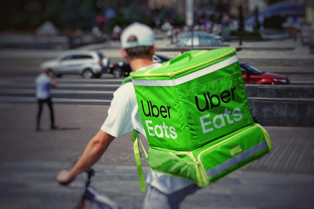
Uber Eats
Uber Eats has one of the most recognizable logos in the food delivery industry. The logo features the word “Uber” in its signature font, with the word “Eats” written in a custom font that resembles a fork. The logo is simple, yet effective, as it communicates the brand’s connection to Uber while also emphasizing its focus on food delivery.
The color scheme of the logo is black and white, which gives it a modern and sleek look. The logo is also easily recognizable, which helps customers identify the brand quickly. The simplicity of the logo makes it easy to remember and associate with the brand, which is essential for creating a strong brand identity.
Grubhub
Grubhub’s logo is another example of a successful food delivery logo. The logo features the word “Grubhub” in a bold, sans-serif font, with the letters “G” and “b” connected to form a smiling face. The logo is playful and fun, which helps to create a positive association with the brand.
The color scheme of the logo is green and white, which gives it a fresh and natural look. The use of green also emphasizes the brand’s focus on food and healthy eating. The logo is easily recognizable, which helps customers identify the brand quickly.
Doordash
Doordash’s logo is a great example of a food delivery logo that communicates the brand’s focus on speed and convenience. The logo features the word “Doordash” in a bold, sans-serif font, with a red checkmark next to it. The checkmark symbolizes speed and efficiency, which is essential for a food delivery service.
The color scheme of the logo is red and white, which gives it a bold and eye-catching look. The use of red also emphasizes the brand’s focus on speed and urgency. The logo is easily recognizable, which helps customers identify the brand quickly.
Overall, these case studies demonstrate the importance of creating a strong and recognizable logo for a food delivery service. A successful logo should be simple, easily recognizable, and communicate the brand’s focus and values. By creating a logo that resonates with customers, food delivery services can establish a strong brand identity and build customer loyalty.
Common Mistakes to Avoid in Food Delivery Logo Design
When designing a food delivery logo, it’s important to avoid common mistakes that can make your logo ineffective or even harmful to your brand. Here are some mistakes to avoid:
1. Overcomplicating the Design
Your logo should be simple and easy to recognize. Avoid overcomplicating the design with too many elements, colors, or fonts. A cluttered logo can be difficult to read and remember, and it may not be scalable for different sizes and formats.
2. Copying Other Brands
While it’s okay to get inspiration from other brands, copying their logos is not. Your logo should be unique and distinguishable from others in the industry. Copying another brand’s logo can lead to legal issues and damage your brand’s reputation.
3. Using Inappropriate Colors
Colors play a crucial role in logo design and can affect how your brand is perceived. Avoid using colors that are too bright or clash with each other. Also, be mindful of cultural associations with colors. For example, red is often associated with danger or warning in Western cultures, but it represents good luck in many Asian cultures.
4. Neglecting Scalability
Your logo should be scalable to different sizes and formats, from a small icon on a mobile app to a large billboard advertisement. Neglecting scalability can result in a logo that is pixelated or blurry when resized, making it difficult to read and recognize.
5. Ignoring Brand Values
Your logo should reflect your brand’s values and personality. Ignoring your brand values can result in a logo that is disconnected from your brand identity and fails to resonate with your target audience.
By avoiding these common mistakes, you can create a food delivery logo that is simple, unique, scalable, and aligned with your brand values.
Conclusion
Congratulations! You have successfully learned how to create the best logo for your food delivery service.
In this article, we discussed the significance of food delivery logos and how they represent the soul of your brand. We also provided you with some effective and not-so-effective logos for meal delivery services, along with suggestions on how to improve your design.
Remember, your food delivery logo should be unique, eye-catching, and easily recognizable. It should also represent your brand’s personality and values.
When designing your logo, keep in mind the following tips:
- Choose a color scheme that reflects your brand’s personality and values
- Use a font that is easy to read and matches your brand’s style
- Incorporate images or icons that represent your brand’s offerings
- Keep it simple and avoid clutter
By following these tips, you can create a logo that will set your food delivery service apart from the rest and attract more customers.
We hope this article has been helpful in guiding you towards creating the perfect logo for your food delivery service. Good luck!
Barry Edwards is a digital marketing expert with a deep understanding of content strategy, logo, and branding principles. Holding a Bachelor’s degree in Marketing from Beaconhill College, he offers valuable insights on digital marketing trends and strategies through his writing. Follow Barry’s work to stay updated on the latest in online marketing and branding.


