Are you looking to add a touch of nostalgia to your design projects? Look no further than retro color palettes. These color schemes are inspired by past eras, from the bold and bright hues of the 1960s to the muted and earthy tones of the 1970s.
Retro color palettes can evoke feelings of nostalgia and warmth, making them a popular choice for branding, packaging, and web design. They can also add a unique and memorable touch to your designs. Whether you’re aiming for a vintage look or simply want to experiment with different color combinations, retro palettes offer a wealth of inspiration.
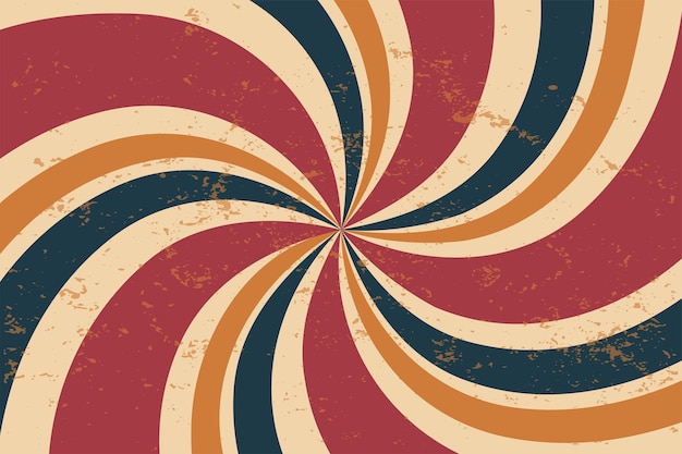
Understanding Retro Color Palettes
If you’re looking to evoke nostalgia and create a vintage feel in your designs, a retro color palette can be a great way to achieve that. But what exactly is a retro color palette? And how can you create one that works well for your project?
A retro color palette is a set of colors that is inspired by the colors used in designs from the past. These colors are often bright and bold, and they can be used to create a fun and playful look. Retro color palettes can also be more muted and subdued, with a sepia or grayish tinge that gives them an antique feel.
When creating a retro color palette, it’s important to consider the time period you want to reference. Different eras had different color trends, and using the right colors can help you create a more authentic look. For example, pastel colors are often associated with the 1950s, while bright neons were popular in the 1980s.
Here are some tips for creating a retro color palette that works well for your project:
- Look to the past for inspiration: Take a look at old posters, records, films, and branding from the time period you want to reference. This can give you a good idea of the colors that were popular at the time.
- Use color theory: When selecting colors for your retro color palette, consider using color theory to create a harmonious and balanced look. For example, you might choose colors that are complementary or analogous to each other.
- Experiment with different combinations: Don’t be afraid to try out different retro color combinations to see what works best for your project. You might find that a more muted palette works better for a vintage feel, or that bold neons are perfect for a playful look.
Overall, creating a retro color palette can be a fun and creative way to add some nostalgia to your designs. By looking to the past for inspiration and experimenting with different color combinations, you can create a unique and authentic retro look that is sure to stand out.
Key Features of Retro Color Palettes
When it comes to creating a retro color palette, there are some key features to keep in mind. In this section, we’ll take a closer look at the most important aspects of retro color palettes, including color combinations, shades, and tones.
Color Combinations
One of the most important features of a retro color palette is the color combinations used. Retro color palettes often include a mix of muted and bright colors, with bold shades and warm tones being particularly popular. Neon colors can also be used to add a touch of vibrancy to a retro color palette.
When choosing color combinations for your retro color palette, it’s important to consider the time period you’re trying to evoke. For example, burnt orange and brown were popular colors in the 1970s, while teal and pink were popular in the 1950s.
Shades and Tones
Another important aspect of a retro color palette is the use of shades and tones. Retro color palettes often include a mix of light and dark shades, as well as a range of muted and bold tones.
When choosing shades and tones for your retro color palette, it’s important to consider how they will work together. A good rule of thumb is to choose shades and tones that are complementary, such as pastel pink and mint green.
In conclusion, when creating a retro color palette, it’s important to consider the color combinations and shades and tones used. By choosing the right mix of colors, you can create a retro color palette that evokes the time period you’re trying to capture.
Retro Color Palette Designs
When it comes to designing with a retro color palette, there are endless possibilities. From geometric designs to vintage posters, this style can add a touch of nostalgia and personality to any project. Here are two popular design options to consider:
Geometric Designs
Geometric designs are a perfect match for a retro color palette. These designs often feature bold shapes and lines, making them the perfect canvas for bright and vibrant colors. Think about incorporating colors like mustard yellow, burnt orange, and deep teal for a 70s-inspired look. You can also consider using a muted color palette of pastels and earthy tones for a more subtle retro vibe.
To create a successful geometric design, it’s important to pay attention to the color balance. You want to make sure that the colors complement each other and don’t clash. Consider using a color wheel to help you choose a harmonious color scheme. You can also experiment with different textures and patterns to add depth and interest to your design.
Vintage Posters
Another popular option for a retro color palette is vintage posters. These designs are often inspired by old movie posters, advertisements, and VHS tapes. They typically feature bold typography, bright colors, and playful illustrations.
When designing a vintage poster, it’s important to pay attention to the typography. Choose a font that fits the era you’re trying to emulate. For example, if you’re going for a 60s vibe, consider using a bold sans-serif font. You can also experiment with different text effects like drop shadows and outlines to make the text pop.
When it comes to choosing colors for your vintage poster, think about using bright and bold colors like red, blue, and yellow. These colors will help your poster stand out and grab attention. You can also consider using a muted color palette of pastels and earthy tones for a more subtle retro vibe.
Overall, designing with a retro color palette can be a fun and creative way to add personality to your projects. Whether you’re creating a geometric design or a vintage poster, make sure to pay attention to the color balance and typography to create a successful and cohesive design.
Retro Color Palettes in Marketing and Media
When it comes to marketing and media, retro color palettes can be a powerful tool to evoke nostalgia and create a sense of familiarity with your audience. By using colors that were popular in the past, you can tap into the retro charm that many people find appealing. Here are some ways you can use retro color palettes in your marketing and media efforts.
Social Media
Social media is a great place to use retro color palettes, especially if you’re targeting an older demographic. Platforms like Facebook and Instagram offer a variety of ways to incorporate retro colors into your posts and ads. For example, you can use vintage filters to give your photos a retro look or create graphics with vintage-inspired color schemes. By using these colors, you can create a sense of nostalgia and appeal to your audience’s emotions.
Sales and Marketing
In sales and marketing, retro color palettes can be used to create a sense of familiarity and trust with your audience. By using colors that were popular in the past, you can tap into the collective memories of your audience and create a sense of nostalgia. This can be especially effective when selling products or services that have a retro or vintage feel. For example, a company that sells vintage clothing could use a retro color palette in their marketing materials to create a sense of nostalgia and appeal to their target audience.
When using retro color palettes in sales and marketing, it’s important to be mindful of the context. While retro colors can be effective in certain situations, they may not be appropriate for every brand or product. It’s important to consider your audience and the message you want to convey before incorporating retro colors into your marketing materials.
Overall, retro color palettes can be a powerful tool in marketing and media. By tapping into the collective memories of your audience, you can create a sense of nostalgia and familiarity that can help build trust and drive sales. Whether you’re using retro colors on social media or in your marketing materials, be sure to use them in a way that is appropriate for your brand and audience.
Creating Your Own Retro Color Palette
If you want to create your own retro color palette, there are a few ways to go about it. You can use AI or templates to help you create a unique and authentic retro color scheme. Here are two methods you can use to create your own retro color palette:
Using AI
One way to create a retro color palette is to use AI. There are many AI-powered tools available that can help you generate a retro color scheme based on your preferences. These tools use algorithms to analyze vintage color palettes and create color combinations that evoke a retro feel.
Some popular AI-powered tools for creating retro color palettes include Colormind, Paletton, and Coolors. These tools allow you to input your preferred colors or choose from a set of pre-designed palettes. They then generate a retro color scheme that you can use in your design projects.
Using Templates
Another way to create a retro color palette is to use templates. Many design templates come with pre-designed color schemes that evoke a retro feel. These templates can be a great starting point for your retro design projects.
There are many websites that offer retro design templates, such as Canva, Creative Market, and Etsy. These templates can be customized to fit your specific design needs. You can also use them as inspiration to create your own retro color palette.
In conclusion, creating a retro color palette can be a fun and creative process. Whether you choose to use AI or templates, there are many resources available to help you create a unique and authentic retro color scheme. By using these methods, you can create a retro color palette that will add a touch of nostalgia to your design projects.
Free Retro Color Palette Collections
Looking for some free retro color palettes to spice up your designs? Look no further than these curated collections!
Color Hunt
Color Hunt is a website that offers a variety of color palettes for free. Their retro collection includes warm and cool tones, pastels, neons, and more. Each palette includes hex codes for easy use in your designs. Simply browse their collection and choose the palette that best fits your needs.
Curated Collections
There are several other websites that offer curated collections of retro color palettes for free. Lospec Palette List is a database of palettes for pixel art, including palettes that originate from old hardware and palettes created by pixel artists. Shutterstock also offers a free download of 25 retro color combinations. And Freepik has a collection of over 90,000 retro color palette images available for free download.
Whether you’re looking for warm and cozy or bright and bold, these free retro color palette collections have got you covered.
Retro Color Palettes in Various Industries
When it comes to using retro color palettes in design, there are many industries that can benefit from this trend. Retro color palettes can evoke feelings of nostalgia, warmth, and familiarity, making them perfect for a variety of design projects. In this section, we will explore how retro color palettes can be used in two industries: designing logos and website design.
Designing Logos
Retro color palettes can be a great choice for designing logos. They can give a brand a sense of history and tradition, while also making it stand out from competitors. When designing a logo with a retro color palette, it’s important to choose colors that are both nostalgic and modern. Some popular retro color palettes for logos include:
- Vintage Pastels: Soft, muted pastels like dusty rose, pale blue, and mint green can create a vintage feel for a brand.
- Bold and Bright: Bold colors like orange, red, and yellow can be paired with black or white to create a retro look.
- Earthy Tones: Colors like olive green, burnt orange, and mustard yellow can create a warm, inviting feel for a brand.
Website Design
Retro color palettes can also be used in website design to create a unique and memorable user experience. When using retro colors in web design, it’s important to balance the vintage feel with modern design elements. Some popular retro color palettes for websites include:
- 80s Neon: Bright, neon colors like hot pink, electric blue, and lime green can create a fun, retro vibe for a website.
- 60s Mod: Bold, graphic colors like black and white, with pops of bright orange, red, or yellow can create a mod-inspired look for a website.
- 70s Earth Tones: Warm, earthy colors like rust, brown, and olive green can create a cozy, retro feel for a website.
In conclusion, retro color palettes can be a great choice for a variety of design projects, including designing logos and website design. When using retro colors, it’s important to strike a balance between the vintage feel and modern design elements to create a unique and memorable user experience.
Exploring Vintage and Muted Color Palettes
When it comes to creating a retro design, using vintage and muted color palettes can be highly effective. These color schemes can create a sense of nostalgia and evoke a feeling of the past. In this section, we will explore some of the most popular vintage and muted color palettes that you can use for your retro designs.
Vintage Color Palettes
Vintage color palettes are characterized by their warm, earthy tones and faded, grainy appearance. These color schemes are often inspired by the colors of old photographs, films, and advertisements. Some popular vintage color palettes include:
- Sepia: This color palette is characterized by its brownish-yellow hue, which mimics the look of old photographs. Sepia tones can be used to create a sense of nostalgia and warmth.
- Retro Pastels: These soft, muted colors are reminiscent of the 1950s and 60s. Retro pastels can be used to create a playful, whimsical feel.
- Bold and Bright: Bold and bright color palettes are often associated with the 1980s and 90s. These colors are vibrant and eye-catching, and can be used to create a sense of energy and excitement.
Muted Color Palettes
Muted color palettes are characterized by their soft, understated tones. These color schemes are often inspired by nature, and can create a sense of calm and tranquility. Some popular muted color palettes include:
- Earth Tones: Earth tones are colors that are found in nature, such as browns, greens, and blues. These colors can create a sense of warmth and comfort, and are often used in rustic or natural designs.
- Faded Neutrals: Faded neutrals are muted versions of traditional neutral colors, such as gray and beige. These colors can create a sense of sophistication and understated elegance.
- Monochromatic: Monochromatic color palettes use different shades of the same color to create a cohesive and harmonious design. These color schemes can create a sense of simplicity and minimalism.
In conclusion, using vintage and muted color palettes can be a great way to create a retro design. Whether you’re looking to create a sense of nostalgia or evoke a feeling of calm and tranquility, there’s a vintage or muted color palette that’s perfect for your needs.
Barry Edwards is a digital marketing expert with a deep understanding of content strategy, logo, and branding principles. Holding a Bachelor’s degree in Marketing from Beaconhill College, he offers valuable insights on digital marketing trends and strategies through his writing. Follow Barry’s work to stay updated on the latest in online marketing and branding.


