Spring is a time of renewal and rejuvenation, and what better way to capture that spirit than with a fresh new color palette for your logo design? Whether you’re refreshing an existing brand or starting from scratch, incorporating the right colors can make all the difference in creating a memorable and impactful logo.
When it comes to choosing a spring color palette for your logo, there are a few things to keep in mind. First and foremost, consider the emotions and associations that different colors evoke. For example, shades of green can represent growth, renewal, and nature, while yellows and oranges can convey warmth, energy, and optimism. By selecting colors that align with your brand’s values and messaging, you can create a logo that resonates with your audience and communicates your unique identity.
Of course, choosing the right colors is just one piece of the puzzle when it comes to designing a successful logo. From typography to composition to overall style, there are many factors to consider when creating a visual representation of your brand. However, by starting with a fresh and vibrant spring color palette, you can set the tone for a logo that truly stands out and captures the essence of your brand.
Understanding Spring Color Palette
Spring is a season of renewal and rejuvenation, and the colors that represent it reflect those qualities. The spring color palette is a versatile and dynamic range of colors that can evoke a sense of optimism, growth, and freshness. In logo design, using spring colors can help convey a sense of new beginnings, creativity, and positivity.
Defining Spring Colors
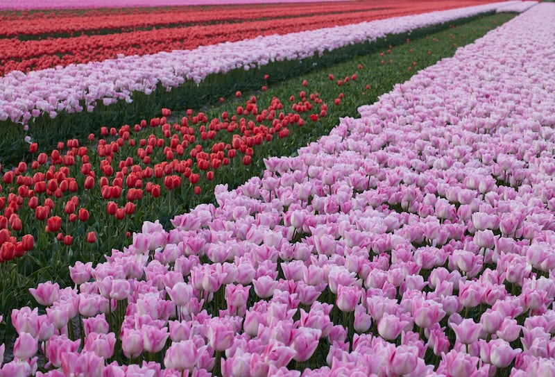
Spring colors are typically light, bright, and pastel hues. They are inspired by the colors of nature during the spring season, such as blooming flowers, fresh green leaves, and clear blue skies. Some common spring colors include:
- Lilac: a soft, muted purple
- Yellow: a bright, cheerful color that symbolizes happiness and optimism
- Sky Blue: a light, airy blue that represents clarity and tranquility
- Coral: a warm, vibrant pink-orange that conveys energy and excitement
- Sage Green: a soft, muted green that represents growth and harmony
Significance in Logo Design
Using spring colors in logo design can help convey a sense of new beginnings, creativity, and positivity. Spring colors can be used to represent a wide range of industries, from fashion and beauty to health and wellness. Here are some examples of how spring colors can be used in logo design:
- Lilac: a popular choice for beauty and wellness brands, as it conveys a sense of relaxation and calmness.
- Yellow: a great color for food and beverage brands, as it stimulates the appetite and conveys a sense of happiness and joy.
- Sky Blue: a popular choice for technology and finance brands, as it represents clarity and trustworthiness.
- Coral: a great color for fashion and lifestyle brands, as it conveys a sense of energy and excitement.
- Sage Green: a popular choice for health and wellness brands, as it represents growth and harmony.
In conclusion, the spring color palette offers a versatile and dynamic range of colors that can evoke a sense of optimism, growth, and renewal. Using spring colors in logo design can help convey a sense of new beginnings, creativity, and positivity. By understanding the significance of spring colors in logo design, you can create a brand identity that is fresh, vibrant, and memorable.
Incorporating Spring Colors into Logo Design
Spring is a season of renewal, growth, and optimism. It’s a time when people are looking for fresh starts and new beginnings. As a designer, you can tap into this energy by incorporating spring colors into your logo designs. Here are some tips to help you get started.
Choosing the Right Colors
When choosing colors for your spring logo design, think about the colors of nature in spring. Pastel colors like pink, blue, green, and yellow are popular choices. You can also use brighter, more vibrant colors like orange and red to create a sense of energy and excitement.
It’s important to choose colors that complement each other and work well together. You can use a color wheel to help you choose colors that are opposite each other (complementary) or next to each other (analogous). This will help you create a harmonious color palette that looks great.
Balancing Colors
When using multiple colors in your logo design, it’s important to balance them properly. You don’t want one color to overpower the others or to clash with them. One way to balance colors is to use a dominant color and then use other colors as accents.
Another way to balance colors is to use different shades and tints of the same color. This will create a monochromatic color scheme that looks sophisticated and elegant.
Creating Emotion with Colors
Colors have the power to evoke emotions and feelings in people. When designing a spring logo, think about the emotions you want to convey. For example, if you want to create a sense of calm and tranquility, you might use shades of blue and green. If you want to create a sense of excitement and energy, you might use bright, vibrant colors like orange and red.
It’s important to remember that different cultures associate different meanings with colors. For example, in Western cultures, white is associated with purity and innocence, while in some Eastern cultures, it’s associated with death and mourning. Make sure you research the meanings of colors in the culture you’re designing for to avoid any unintended meanings.
Incorporating spring colors into your logo design can help you create a design that feels fresh, vibrant, and full of energy. By choosing the right colors, balancing them properly, and creating emotion with them, you can create a logo that perfectly captures the spirit of spring.
Case Studies of Successful Spring Color Palette Logos
When it comes to designing a logo, color plays a crucial role in conveying a brand’s personality and values. A well-designed logo with a spring color palette can evoke feelings of freshness, renewal, and growth. Here are a few examples of successful logos that use a spring color palette:
1. Starbucks
Starbucks is a well-known brand that uses a green and white color palette for its logo. Green is often associated with nature, growth, and health, making it a perfect choice for a spring color palette. The white background adds a touch of simplicity and elegance to the logo, making it stand out.
2. Instagram
Instagram is another popular brand that uses a spring color palette for its logo. The logo features a gradient of pink, orange, and purple colors, which are often associated with spring flowers and sunsets. The colors not only convey a sense of playfulness and creativity but also make the logo visually appealing.
3. Subway
Subway is a fast-food chain that uses a green and yellow color palette for its logo. The green color represents freshness and health, while the yellow color represents happiness and energy. The combination of these two colors creates a spring color palette that perfectly aligns with the brand’s values.
4. Whole Foods
Whole Foods is a grocery store chain that uses a green and brown color palette for its logo. The green color represents freshness and health, while the brown color represents natural and organic products. The combination of these two colors creates a spring color palette that aligns with the brand’s values and mission.
5. Target
Target is a retail store that uses a red and white color palette for its logo. While red is not typically associated with spring, it is often used to convey energy, excitement, and passion. The white color adds a touch of simplicity and elegance to the logo, making it visually appealing.
In conclusion, a spring color palette can be a great choice for designing a logo that evokes feelings of freshness, renewal, and growth. By studying successful logos that use a spring color palette, you can gain inspiration and ideas for your own logo design.
Common Mistakes to Avoid
When it comes to designing a spring color palette and logo, there are some common mistakes you should avoid to ensure your design is effective and visually appealing. Here are a few mistakes to keep in mind:
1. Using Too Many Colors
One of the biggest mistakes designers make is using too many colors in their palette. While it may be tempting to include every bright, bold color of the season, using too many colors can make your design look cluttered and overwhelming. Stick to a few key colors that complement each other and represent your brand.
2. Ignoring Color Psychology
Color psychology is the study of how colors can influence human mood and behavior. When designing your spring color palette, it’s important to consider the emotions and associations that different colors evoke. For example, green is often associated with growth and renewal, while yellow is associated with happiness and optimism.
3. Choosing Fonts that Don’t Match Your Brand
Your logo is a representation of your brand, and the font you choose can have a big impact on how your brand is perceived. Avoid using fonts that are too trendy or don’t match the tone of your brand. Instead, choose a font that is legible, timeless, and reflects the personality of your brand.
4. Using Outdated Techniques
Just like with any design, it’s important to stay current and avoid outdated techniques. Be wary of using excessive gradients, clip art, or fonts that were popular decades ago. Instead, focus on creating a design that is modern and timeless.
By avoiding these common mistakes, you can create a spring color palette and logo that effectively represents your brand and appeals to your audience.
Future Trends in Spring Color Palette Logos
Spring is a season of renewal and growth, and with it comes a fresh set of color palettes and design trends. As we move into 2023, there are several emerging trends in spring color palette logos that you should keep in mind when designing your brand’s visual identity.
Pastel Colors
Pastel colors have been a popular choice for spring color palettes for years, and they are not going anywhere anytime soon. Soft shades of pink, blue, green, and yellow evoke feelings of freshness and new beginnings, making them perfect for brands that want to convey a youthful and optimistic vibe. Consider pairing pastel colors with a neutral base to create a balanced and harmonious design.
Bright and Bold Colors
On the other end of the spectrum, bright and bold colors are also gaining popularity in spring color palette logos. These colors are eye-catching and energetic, making them perfect for brands that want to stand out and make a statement. Think vibrant shades of orange, red, and purple, paired with contrasting neutrals like black or white to create a high-impact design.
Earthy Tones
As sustainability and eco-friendliness become more important to consumers, earthy tones are becoming a popular choice for spring color palette logos. Shades of green, brown, and tan evoke feelings of nature and the environment, making them perfect for brands that want to convey a sense of responsibility and care for the planet. Consider pairing earthy tones with natural textures and materials to create a cohesive and authentic design.
Monochromatic Designs
Monochromatic designs, where a single color is used throughout the entire design, are also gaining popularity in spring color palette logos. This approach creates a cohesive and minimalist design that is both elegant and modern. Consider using shades of blue or green for a calming and soothing effect, or shades of pink or purple for a more playful and whimsical vibe.
Gradient Effects
Finally, gradient effects are becoming more popular in spring color palette logos. This technique involves blending two or more colors together to create a smooth transition from one shade to another. Gradient effects can create a sense of depth and movement in a design, making it perfect for brands that want to convey a sense of innovation and creativity. Consider using shades of blue or green for a calming and soothing effect, or shades of pink or purple for a more playful and whimsical vibe.
In summary, as we move into 2023, spring color palette logos are becoming more diverse and creative, with a focus on sustainability, minimalism, and innovation. By keeping these emerging trends in mind, you can create a visual identity that is both on-trend and authentic to your brand.
Conclusion
Congratulations! You have now learned about spring color palettes and how they can be used in logo design. Here are some key takeaways to keep in mind:
- Spring colors are typically bright, cheerful, and light.
- There are four types of spring colors: true spring, warm spring, bright spring, and light spring.
- Spring color palettes can be used to evoke emotions such as happiness, joy, and renewal.
- When choosing colors for your logo, consider your brand personality and the emotions you want to convey.
- Your brand logo colors should be carefully defined and chosen based on color theory and their ability to represent your brand.
Remember, your logo is often the first thing people see when they encounter your brand. By using a spring color palette in your logo design, you can create a memorable and impactful brand identity that resonates with your target audience. Good luck with your logo design process!
Marietta Arnold is a branding and design enthusiast who draws inspiration from hobbies like hiking, photography, and art exploration. With a background in graphic design, she shares insights on branding strategies and logo design trends. Stay updated with Marietta’s work for the latest in branding and design.


