Are you in the process of building a website? If so, you may want to consider creating a website style guide. A website style guide is a document that outlines the design and branding elements of your website, including color palettes, typography, spacing, and more. By creating a website style guide, you can ensure that your website is consistent and cohesive, and that all of the design elements work together seamlessly.
One of the key benefits of creating a website style guide is that it can save you time and money in the long run. By establishing design guidelines upfront, you can avoid the need to make changes to your website down the road. This can be especially important if you are working with a team of designers and developers, as it can help ensure that everyone is on the same page and working towards the same goals.
Another benefit of creating a website style guide is that it can help you establish a strong brand identity. By defining your color palette, typography, and other design elements, you can create a website that is instantly recognizable and memorable. This can be especially important if you are building a website for a business or organization, as it can help you stand out from your competitors and build a strong brand presence online.
Website Branding
Your website’s branding is an essential part of creating a strong online presence. A website style guide can help you maintain consistency in your branding across all pages of your website. In this section, we will discuss the three key elements of website branding: Logo Usage, Color Palette, and Typography.
Logo Usage
Your website’s logo is the most recognizable aspect of your brand. It is essential to use it consistently throughout your website. Your logo should be placed in a prominent location on your website, such as the top left corner or center of your homepage.
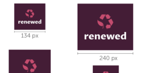
You should also define rules for your logo usage in your website style guide. These rules should include guidelines for the size, placement, and spacing of your logo. Additionally, you should provide guidelines for the use of your logo on different backgrounds and in different formats, such as print or digital.
Color Palette
Your website’s color palette is another critical aspect of your branding. You should define a color palette that reflects your brand’s personality and values. Your color palette should include primary and secondary colors, as well as accent colors.
In your website style guide, you should provide guidelines for the use of each color in your palette. These guidelines should include rules for background colors, text colors, and accent colors. You should also provide guidelines for using your color palette consistently throughout your website.
Typography
Typography refers to the use of fonts on your website. Your website’s typography should be consistent with your brand’s personality and values. You should define a font family that includes both serif and sans-serif fonts.
In your website style guide, you should provide guidelines for the use of each font in your family. These guidelines should include rules for font size, line spacing, and font weight. Additionally, you should provide guidelines for using your typography consistently throughout your website.
By defining rules for Logo Usage, Color Palette, and Typography in your website style guide, you can create a consistent and recognizable brand across all pages of your website.
Layout Principles
When it comes to designing a website, the layout is one of the most important aspects to consider. A well-designed layout can help guide users through your website and make it easier for them to find what they’re looking for. In this section, we’ll discuss some of the key layout principles to keep in mind when designing your website.
Grid System
One of the first things to consider when designing your layout is the grid system. A grid system is a set of guidelines that help you organize and align the different elements on your website. By using a grid system, you can create a consistent and visually appealing layout that is easy to navigate.
There are many different grid systems to choose from, but one of the most popular is the 12-column grid. This grid is based on the idea that most screens can be divided into 12 equal columns. By using this grid, you can easily create layouts that are balanced and visually appealing.
Spacing
Another important aspect of your layout is spacing. Spacing refers to the amount of space between different elements on your website. By using consistent spacing, you can create a clean and organized layout that is easy to read and navigate.
When it comes to spacing, there are a few key things to keep in mind. First, make sure that your spacing is consistent throughout your website. This will help create a sense of unity and make your website feel more polished. Second, make sure that your spacing is appropriate for the size of your website. If you have a lot of content, you may need to use more spacing to make it easier to read.
Alignment
Finally, alignment is another important aspect of your layout. Alignment refers to the way that different elements on your website are lined up with each other. By using consistent alignment, you can create a visually appealing layout that is easy to navigate.
When it comes to alignment, there are a few key things to keep in mind. First, make sure that your alignment is consistent throughout your website. This will help create a sense of unity and make your website feel more polished. Second, make sure that your alignment is appropriate for the type of content you are displaying. For example, if you are displaying images, you may want to use a centered alignment to make them stand out.
Navigation
Navigation is an essential part of any website, and it plays a critical role in user experience. A well-designed navigation system can make it easier for users to find what they are looking for and improve their overall experience on your website. In this section, we will discuss the two important sub-sections of navigation, Menu Structure, and Link Behavior.
Menu Structure
The menu structure is the backbone of your website’s navigation system. It is the foundation that supports all other navigation elements, such as dropdown menus, submenus, and links. A well-structured menu makes it easier for users to find what they are looking for quickly.
When designing your website’s menu structure, keep it simple and intuitive. Use clear and concise labels that accurately describe the content they represent. Avoid using jargon or technical terms that may confuse your users. Organize your menu items in a logical and hierarchical order, with the most important items at the top level and the less important ones nested under them.
Here is an example of a well-structured menu:
| Home | About Us | Services | Products | Contact Us |
Link Behavior
Link behavior refers to how links behave when users interact with them. It includes things like hover effects, active states, and click behavior. Good link behavior can improve the user’s experience and make it easier for them to navigate your website.
When designing your link behavior, keep it consistent throughout your website. Use clear and intuitive hover effects that indicate to the user that the link is clickable. Use active states to show the user which page they are currently on. When a user clicks on a link, make sure it takes them to the correct page quickly.
Here are some best practices for link behavior:
- Use clear and intuitive hover effects
- Use active states to show the user which page they are on
- Ensure that links take the user to the correct page quickly
In conclusion, good navigation is essential for any website. By following these best practices for menu structure and link behavior, you can improve the user’s experience and make it easier for them to find what they are looking for.
Imagery
https://www.youtube.com/watch?v=YPKLpIogig0&embed=true
When it comes to creating a website style guide, imagery is an essential element that should not be overlooked. High-quality images can help you establish a strong brand identity and convey your message to your audience more effectively. In this section, we’ll discuss two essential sub-sections of imagery: Image Style and Iconography.
Image Style
The image style you choose for your website can have a significant impact on how your brand is perceived. It’s essential to choose images that align with your brand’s values and message. Here are some tips to keep in mind when selecting your image style:
- Use high-quality images that are relevant to your brand and message.
- Choose images that are consistent with your brand’s color palette and typography.
- Consider the tone of your brand and choose images that reflect that tone.
- Use images that are unique and help your brand stand out from the competition.
Iconography
Icons are a great way to add visual interest to your website and make it easier for users to navigate. When choosing icons for your website, here are some things to keep in mind:
- Choose icons that are consistent with your brand’s image style.
- Use icons that are easily recognizable and intuitive.
- Consider the context in which the icons will be used and choose icons that make sense in that context.
- Use icons sparingly to avoid cluttering your website.
In conclusion, imagery is an essential element of your website style guide that can help you establish a strong brand identity and communicate your message effectively. By following the tips outlined in this section, you can choose the right image style and iconography for your website and create a visually appealing and cohesive brand image.
Forms and Inputs
Forms and inputs are an essential part of any website. They allow users to interact with your website and provide valuable information. In this section, we will cover the basics of form layout and button styles.
Form Layout
The layout of your forms is crucial to the user experience. You want to make sure that your forms are easy to use and understand. Here are some tips for creating a user-friendly form layout:
- Use labels: Labels help users understand what information they need to provide. Make sure your labels are clear and concise.
- Group related fields: Grouping related fields together makes it easier for users to understand the purpose of each field.
- Use placeholders: Placeholders can provide additional information for users. However, make sure that the placeholders are not mistaken for actual input.
Button Styles
Buttons are an important part of form design. They allow users to submit their information and move on to the next step. Here are some tips for creating effective button styles:
- Use contrasting colors: Make sure that your buttons stand out from the rest of the page. Use contrasting colors to draw attention to the button.
- Use clear text: Make sure that the text on your button is clear and concise. Users should know exactly what will happen when they click the button.
- Use hover effects: Hover effects can provide additional feedback to users. Consider adding a hover effect to your buttons to make them more interactive.
Overall, creating a user-friendly form and input design is crucial to the success of your website. By following these tips, you can create a design that is easy to use and understand.
Coding Standards
When it comes to website development, coding standards are essential to ensure that your code is readable, maintainable, and consistent. In this section, we will discuss the coding standards for HTML, CSS, and JavaScript.
HTML Standards
HTML is the foundation of any website, and it is crucial to follow the standards to ensure that your code is accessible and easy to read. Here are some HTML coding standards to follow:
- Use lowercase for all HTML tags and attributes.
- Use semantic HTML to improve accessibility and SEO.
- Use indentation to make your code more readable.
- Use comments to explain your code.
CSS Standards
CSS is responsible for the visual appearance of your website, and it is essential to follow the standards to ensure that your code is organized and maintainable. Here are some CSS coding standards to follow:
- Use lowercase for all CSS selectors and property names.
- Use shorthand notation when possible to reduce code bloat.
- Use meaningful names for classes and IDs.
- Use comments to explain your code.
JavaScript Standards
JavaScript is responsible for the functionality of your website, and it is essential to follow the standards to ensure that your code is efficient and easy to maintain. Here are some JavaScript coding standards to follow:
- Use camelCase for variable and function names.
- Use semicolons to end statements.
- Use === instead of == for equality comparisons.
- Use comments to explain your code.
By following these coding standards, you can ensure that your code is consistent, maintainable, and easy to read.
Accessibility Guidelines
https://www.youtube.com/watch?v=H37zF98Er1M&embed=true
When creating a website style guide, it’s important to consider accessibility guidelines to ensure that your website is accessible to all users, including those with disabilities. Here are some key guidelines to keep in mind:
1. Provide Sufficient Contrast
Make sure that there is enough contrast between the foreground and background colors of your website. This will make it easier for users with visual impairments to read your content. A good rule of thumb is to have a contrast ratio of at least 4.5:1 for normal text and 3:1 for large text.
2. Use Alt Text for Images
Include descriptive alt text for all images on your website. This will help users with visual impairments understand the content of the image. It will also help search engines understand the content of your website.
3. Use Descriptive Link Text
Use descriptive link text instead of “click here” or “read more”. This will help users with screen readers understand the purpose of the link without having to read the surrounding text.
4. Provide Keyboard Accessibility
Make sure that your website is accessible using only a keyboard. This means that users should be able to navigate your website using the Tab key and other keyboard shortcuts.
5. Use Headings and Subheadings
Use headings and subheadings to organize your content. This will make it easier for users with screen readers to navigate your website. Make sure to use the proper HTML tags for headings (H1, H2, etc.).
By following these accessibility guidelines, you can ensure that your website is accessible to all users, regardless of their abilities.
Mobile and Responsive Design
In today’s world, more and more people are accessing the internet on their mobile devices. That’s why it’s essential to make sure your website is mobile-friendly and responsive. Responsive design is a design approach that enables automatic adaptation to the screen, whether the content is viewed on a tablet, phone, television, or watch.
To create a mobile-friendly website, you need to consider the following:
- Viewport Meta Tag: This tag will set the viewport of your page, which will give the browser instructions on how to control the page’s dimensions and scaling. It’s essential to include this tag in your HTML code to ensure that your website looks good on all devices.
- Fluid Layouts: Instead of using fixed-width layouts, you should use fluid layouts that adjust to the size of the screen. This way, your website will look great on any device.
- Large Font Sizes: It’s essential to use large font sizes on your website to make it easier to read on mobile devices. A font size of at least 16px is recommended.
- Mobile-Friendly Navigation: Your website’s navigation should be easy to use on a mobile device. You can use a hamburger menu or a drop-down menu to make it easier for users to navigate your website.
- Fast Loading Times: Mobile users expect websites to load quickly. You can optimize your website’s images and use caching to improve loading times.
By following these guidelines, you can create a mobile-friendly and responsive website that looks great on any device.
Barry Edwards is a digital marketing expert with a deep understanding of content strategy, logo, and branding principles. Holding a Bachelor’s degree in Marketing from Beaconhill College, he offers valuable insights on digital marketing trends and strategies through his writing. Follow Barry’s work to stay updated on the latest in online marketing and branding.


