When creating your brand for your company, you will have to make a lot of choices. Within your choices are your decisions for your logo.
Logos are very important because of the role they play for your company. These symbols are the first step in creating an impression with clients.
A great logo will be memorable, easy to understand and represent its company’s brand well. One of your major decisions when crafting a logo will be what type of logo you want to use.
There are two main categories of logos. Those that are name-based logos and those that are icon or image-based logos. Within these categories, there are nine different types of logos overall.
Nine different types might seem overwhelming but have no fear. Keep reading to understand the benefit of each type of logo in order to determine which one might be the best fit for you.
Name-Based Logos
Name-based logos are as described; they are logos that only utilize the name of their company within their logo rather than also including icons or images. Some forms of these logos are more popular than others but they all provide an important level of professionalism.
One of the best parts about name-based logos is that viewers immediately know what the name of your company is. It is one of the safer bets for companies that are not yet well established.
An important thing to keep in mind if you decide on a name-based logo is that it must be legible in order to be effective. Because the logo might only consist of the name, initials, or first letter of your company, it needs to be easily read. If clients can’t read it, it won’t be effective.
Logotypes or Wordmark Logos
Logotypes or wordmark logos are logos that consist only of the company’s full name. They do not have additional icons or abbreviations.
It might sound boring to just have your name as your logo, but these logotypes are well designed, eye-catching, and aesthetically pleasing. There are many great examples of logotypes available online.
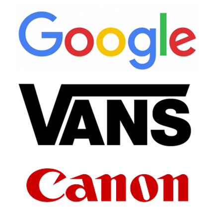
Our examples are the wordmark logos presented by Google, Vans, and Canon.
If you choose this type of logo, make sure that the font you choose doesn’t distort the letters. You don’t want viewers to misinterpret your logo.
Do Logotypes or Wordmark Logos Work for You?
Because logotypes consist only of the company’s name, it is important that the name is easy to read and memorable. Having a unique name that will stay in clients’ minds is very helpful to this type. If your company name is difficult to understand at a glance, then this might not be the type of logo for you.
If you choose to use a logotype, make sure to spend plenty of time choosing a font to use. The right font can really make your logo shine within this category.
If no fonts are working for you, you can always specially create your own font or hire an artist to create a font for you. Creating your own font is a great way to make sure that your logo matches the impression you are trying to give your company.
Monograms or Lettermarks
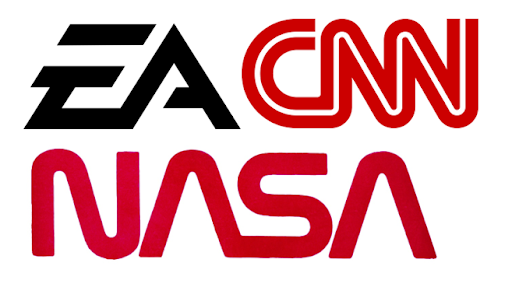
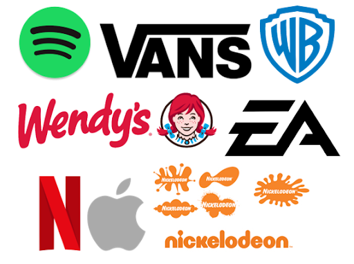
Monograms or lettermarks are logos that are based upon the initials or abbreviations of their company’s name. Our examples are EA which stands for Electronic Arts, CNN which stands for Cable News Network, and NASA which stands for National Aeronautics and Space Administration.
Logos that go this route need to have initials or abbreviations that are easy to remember, sound nice when spoken out loud, and are not replicating the initials or abbreviations of another company.
Do Monograms or Lettermarks Work for You?
If your company name is very long or boring, using initials or abbreviations might be the way to go. This can help make your logo less boring, easier to remember, and fun to say.
Just as with logotypes, monograms must have a great font in order for them to really pop. Make sure to spend plenty of time choosing one.
Hiring an artist to create a special font for your monogram can be super beneficial. Because these types of logos are smaller due to fewer letters, less information can be shown through the font. Having a specially created one can increase this visual information to improve viewers’ impression of your brand.
Letterforms
Letterform logos are logos that consist only of the first letter of their company name. When done well, they can be very impactful while also appearing very simple and elegant.
The design of these logos is very important to their success. That usually means going a step farther than just choosing a font but redesigning the entire letter so that it helps to represent your brand as much as possible.
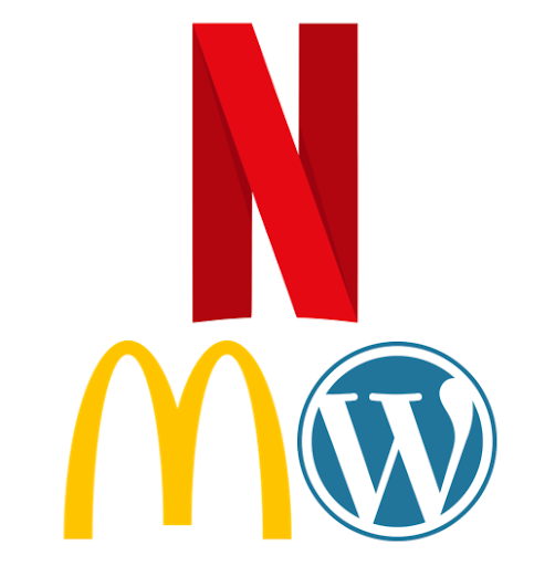
Examples of companies that use letterform logos are McDonald’s, WordPress, and Netflix.
Do Letterforms Work for You?
This type of logo works best with companies that are already well established. If Netflix wasn’t so big and well known, then their red letter ‘N’ would mean very little to viewers. But because they are well known, then their logo is synonymous with their company.
If your company isn’t as well established, then this might be a more difficult logo to choose. If you are established and you choose this type of logo, make sure that your letter design represents your brand and is unique so that your viewers can identify it as yours.
If you go with this type of logo, try to keep any change to your logo as minimal as possible so that it remains recognizable to your clients. You can’t trademark a letter, so it is important that the design of that letter remains familiar as there might be other companies using the same letter in their own logos.
Icon or Image-Based Logos
Icon or image-based logos are as described; they utilize images or icons to represent their brand. There is a large variety of images used and they all help to represent their company.
It is important that you choose an image that will represent your brand well. Some companies lend themselves to more solid and specific images while others have to lean more toward the abstract.
One of the downfalls of these types of logos is that if a viewer does not recognize your logo, they will have a much harder time finding out your company name and what you are selling.
Logo Symbols or Brand Marks
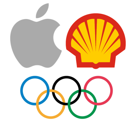
Logo symbols or brand marks are a type of icon logo that goes more for a literal representation of their company name. Examples of this are Apple’s apple, Shell’s shell, and the Olympics’ winner’s rings.
Most brand marks, when reviewed by a client, are able to communicate the name, or close to the name, of the company they are representing.
Do Logo Symbols or Brand Marks Work for You?
If the name of your company directly translates to an image or icon well, then this could be a really great choice for your company. If it’s not that simple, then this might not be the right type for you.
With this type of logo, it is important that the viewer is able to recognize and understand the image. For example, if they can’t tell that your apple is an apple, they will have a much harder time discerning that the logo represents your Apple company.
An easy way to see if viewers understand your image is to ask them. If there is any hesitation or doubt at all, then it might be smart to try redesigning your image. It doesn’t mean that your idea won’t work, but just that you need to refine it more.
Abstract Logo Marks
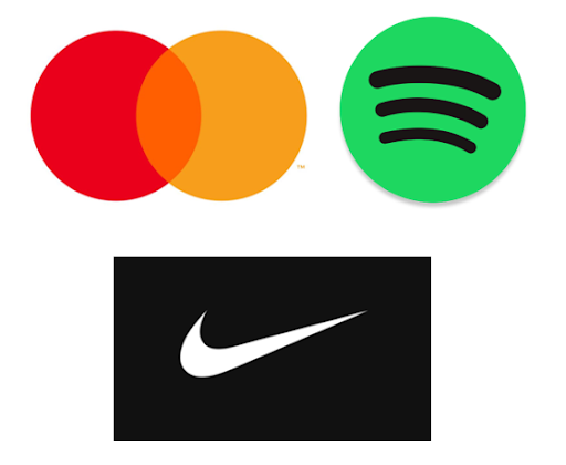
Abstract logo marks are similar to brand marks. The only difference is that abstract logo marks use abstract designs that don’t have anything to do with the company name. Examples of this are the colored MasterCard circles, the green Spotify circle, and the Nike swoosh.
These types of logos are most often made of different shapes. Some companies have a nice backstory to their abstract logo, although not all, yet overall they don’t need a backstory in order to still be successful.
With this type of logo, you can make design decisions based on logical things. For example, maybe you have four branches within your company so in your logo you put four different colors or four different shapes to represent that.
The overall greatest benefit of abstract logos though is there doesn’t have to be any reason for your design choice. You could choose your logo just because you think it looks nice.
Do Abstract Logo Marks Work for You?
Because these abstract logos can be almost anything, they are very versatile, working across all different platforms with all kinds of different clients. These can be some of the most enjoyable logos to design.
The main downside to abstract logo marks is that if you are not well-established, it might be hard for clients to identify you by just an icon. An abstract shape does not provide much information about itself.
Whereas you can type “apple logos” into a search engine to discover the Apple company, it is a lot harder to describe some abstract images in a way that will provide results.
Mascots
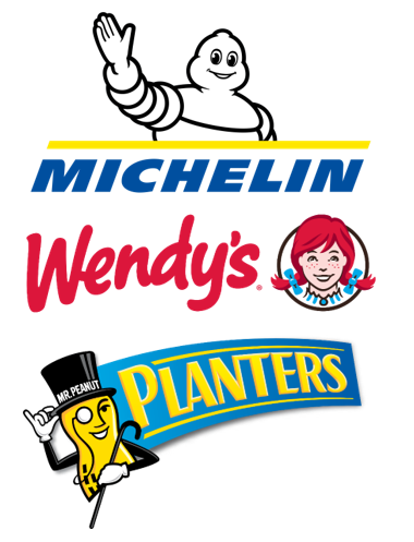
Mascot logos are just as described; they utilize mascots within their logo. Mascots can help viewers connect with companies. These mascots are often created to attract children’s attention to their brand, but that is not always the case.
Mascots are almost always exactly what the company name says. Examples of this type of logo are the Planters having a peanut mascot. Wendy’s uses their female icon as its logo. The last example is the Michelin logo having their Michelin Man as the main feature.
Do Mascot Logos Work for You?
It can be fun to create a mascot for your branding and logos. However, most mascots have something to do with their company name or service.
Choosing a mascot that has nothing to do with your company is not very helpful. Clients need to be able to recognize and identify the mascot as belonging to the company in order for it to be effective.
Some companies lend themselves better to mascots than others. Take a look at your own company to see if using a mascot logo would be a good option for you or not.
Emblem Marks
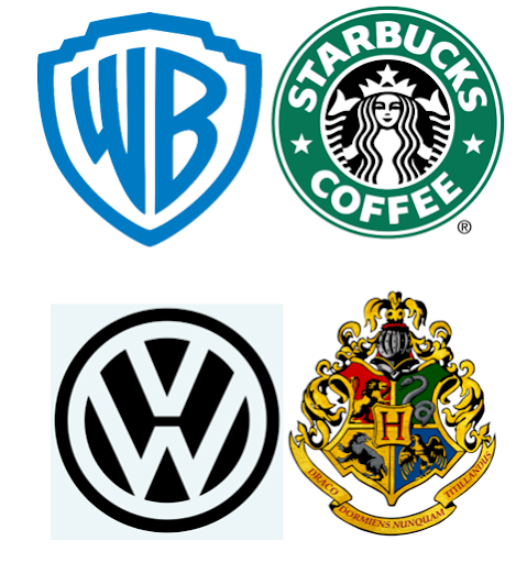
Emblem marks normally are circular or emblem-shaped. While this isn’t always the case, most emblem logos have some form of their company name within them. Some companies choose to go by initials or abbreviations for this reason.
Examples of emblem marks are the Volkswagen logo, the Harry Potter Hogwarts logo, the Starbucks Coffee logo, and last, the Warner Brothers logo.
The main downfall of these types of logos is that they will be more difficult to describe for clients that are trying to look up the logo in a search engine.
Do Emblem Marks Work for You?
Because emblems provide some information about their company name within their logo, in addition to their design, they can work well for companies that are already established and those that are newer.
Most emblems are very intricately designed and take a while to create a really nice pattern. If you do not have enough time to put into the emblem design, then it might be best to choose a different type of logo.
Another option if you don’t have time to design your emblem logo is to hire an artist to create one for you. This is a great way to make sure it gets enough attention to be effective.
Dynamic Marks
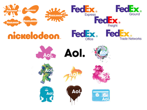
Dynamic marks are logos that change their design very frequently. Examples of this are Nickelodeon, FedEx, and Aol.
These types of logos are often more fun than the rest because they can change so frequently. Using this type of logo can be great if your target audience is children.
Do Dynamic Marks Work for You?
These types of logos can be really great if your company needs to be super flexible because it covers a wide range of services or many other things. You don’t have to be stuck by the rigidity of the other logotypes.
Because dynamic marks can have such a variation, you also need to be contributing to these frequent logo changes. This can be time-consuming as you come up with new ideas, design them, and implement them.
When changing your logo, you need to make sure there is something within your design that stays consistent throughout all the changes. For Nickelodeon, this is the way that their name, color, and font remain the same, no matter what their icon shape does.
Combination Marks
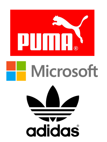
Combination marks are one of the last types of logos available. These logos use both words and images in their design.
This type of logo is very popular because you are not as restricted with what you do. You can use any type of name-based logo and pair it with any type of icon-based logo.
If your company is just starting out, this could be a great choice for you. It is very versatile and allows audiences to be able to recognize more than one thing.
You do want to be careful that your name and image work together well. They both need to support your brand and be aesthetically pleasing as a design when they come together for your logo.
The examples provided here are Puma with a brand mark logo and Microsoft and Adidas with abstract logo marks. All three of these companies use their full company name.
Do Combination Marks Work for You?
If you are having a hard time settling on just your name or just an image, this could be the best way to go. Once you are more established, you can always break the icon away from your name and use them separately.
For combination logos, they are most often viewed with the name and logo together. However, there can be some instances where just using one of them will be best.
Using a combination logo is one of the easiest routes to take because your audience doesn’t have to already know you, and you are not just relying on your font to gain business but an icon as well.
The major downfall of combination logos is that they tend to take up more space and not shrink down as easily due to having both icon and word elements.
Choosing Your Logo Type
After careful consideration, you can choose which one of the nine logo options works best for you and your company. Make sure to take your time with this decision.
While it is common to revamp your logo, this normally happens after having it for a few years, and normally you choose to keep the same type of logo throughout the changes. Only rarely will you change the type of logo as well as the design.
Consider how established your company is, what kind of company name you have, how many services you provide, and who your target audience is. These elements are important to consider when choosing a type.
If you are having trouble deciding on a logo, you can always draw a few examples of what you are thinking of and compare them. Consider how well they demonstrate and vocalize your brand.
Consider using just a name-based logo. What type of font would you use? What type of name-based logo would you choose based on your company name?
Consider using an image-based logo. What image would best represent your company? What type would you go with?
The answers to these questions can help you narrow down your options. At the very least it will help you see what options won’t work for your company.
Talk with some friends and family to get their opinions about your design options. They might have insight that is helpful while you decide.
As soon as you choose the type of logo that you want to use, then you can start creating.
At the very least, narrow down your options to your favorite two or three logo types. You can always fully design a few of them in order to see what results you like best and then decide on which one you will go with.
Creating Your Logo
Once you have decided what type of logo you want to have, you can start creating your logo.
Hiring an artist can be time-consuming and expensive as well as there can be problems with style differences. This is why most people choose to create their own logo.
If you decide to make your logo yourself and not hire an artist, you’ll need to decide on what type of program you want to use.
Some programs require previous knowledge or money for classes in order for you to be successful using them. Thankfully, there is a better option.
Our logo creator allows you to make your logo online in just a few easy steps. Type your company name, choose your category, pick an image, and then design on our easy-to-use editing platform.
In just a short amount of time, you can have your very own logo. The best part is all of it is free. Check out our LogoCreator today to get started.
Barry Edwards is a digital marketing expert with a deep understanding of content strategy, logo, and branding principles. Holding a Bachelor’s degree in Marketing from Beaconhill College, he offers valuable insights on digital marketing trends and strategies through his writing. Follow Barry’s work to stay updated on the latest in online marketing and branding.