
Your company logo is the pillar of your branding strategy.
In most cases, a logo is the visual element that your target audience remembers after interacting with your business. It’s the first thing web visitors look at when landing on your homepage. It directly impacts brand recognition and familiarity — determining potential customers’ willingness to interact with your marketing messages on SERPs and social media. The last of these factors is particularly important to remember, knowing that as many as 82% of people choose a familiar brand name when clicking on SERP results.
When it comes to great logo design, there are several tactics you can employ to ensure your visual identity stands out. And with advanced AI solutions like LogoCreator, you don’t have to be a professional designer to create a beautiful, memorable, and trust-driving logotype.
Nevertheless, if your company name is a bit on the longer side, you might feel it’s hard work fitting all those words and characters into your logo.
This guide will provide you with actionable tips for making long company names work in logo design, offering several directions to pursue depending on your goals and priorities. Let’s get started.
Separate Distinct Words with Color
Color is one of the most powerful tools in your logo design toolbox. It significantly affects logo and brand memorability. It’s also related to consumers’ purchase intent and brand perception. That’s why it’s a great idea to explore opportunities to make your logo stand out through your color choices.
However, what’s particularly interesting about the role of color in logo design is that it can also help overcome the challenges posed by a long company name.
Because using different hues within a single visual element creates separation, breaking up distinct words with color could be an excellent tactic to make your long brand name work in a logo.
For instance, if you check out Mannequin Mall, you’ll see that the brand’s name isn’t just long but also slightly complex due to the spelling of the word “mannequin.” Thus, to prevent this factor from impacting logo memorability and visual clarity, the brand employs a combination of dark blue and red to separate the words, making them easier to read at a glance.
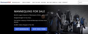
Source: mannequinmall.com
Furthermore, this strategy works equally well for company names that contain three or more words. Dial My Calls, for instance, employs this design tactic to create a separation between the words in its logo, using a light blue shade to boost visual distinction and make its brand name easier to read.
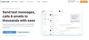
Source: dialmycalls.com
Stack Words Vertically for Better Balance
The thing about a well-designed logo is that it needs to fit into a compact space to appear cohesive. And that can be challenging to accomplish with long company names — especially when compacting words or using acronyms doesn’t align with your branding approach.
You’ll definitely want to find solutions that can help you overcome this issue.
For example, stacking words vertically is an excellent method to achieve better visual balance. Moreover, it can provide visual separation through spacing to create clarity about what your brand does.
The logo used by Bay Alarm Medical is an excellent example of how well this approach can work. Despite a relatively long brand name, the vertically and horizontally spaced logo is cohesive, compact, and clear, thanks to the smart positioning of the “medical” part of the name.

Source: bayalarmmedical.com
If this approach doesn’t yield the results you’re after, it’s also a good choice to consider alternative alignment options.
Take a look at Stumptown Coffee Roasters, and you’ll see that the latest product launch shows off the brand’s name in a semi-circle. It’s how the business adds a fun new twist to its visual identity, which features its long company name in an already familiar font.
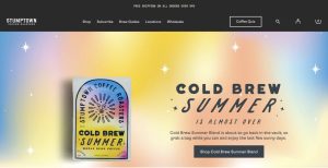
Source: stumptowncoffee.com
Use Condensed Fonts to Save Space
In some cases, the easiest logo design tactic to help overcome the challenge of a long company name is to choose the right font for your brand’s visual identity.
By condensing typography to save space, you can effectively use your wordy company name without it looking bulky, excessive, or imbalanced.
Check out House of Sunny. This business uses a narrow and tall font in its wordmark design, achieving a clean and minimalist look without any visual elements in its logo choice.

Source: houseofsunny.com
If you opt for this logo design approach for your business, keep in mind that it can have some drawbacks. The biggest of these is the potential lack of negative space in your logo. Such a direction could sacrifice readability and accessibility, both of which are crucial for providing prospects with an enjoyable brand experience.
Bold or Lighten Certain Words to Create Hierarchy
Sometimes, the challenge that a long company name creates in your logo design tactic isn’t that it’s difficult to present or balance. Instead, it’s that the multiple (or long) words make it less possible for leads to instantly figure out what it is that your company does.
Admittedly, this may not seem that big of a deal — from a design perspective, at least. Nevertheless, branding and marketing research continually confirm the importance of product understanding in ensuring proper engagement rates.
For instance, a 2022 survey found that 73% of consumers want brands to demonstrate an in-depth understanding of their unique needs.
What’s great is that your branding and logo design strategies can directly help show that your business offers precisely what your target audience seeks.
By bolding or lightening certain words, you don’t just unlock the opportunity to emphasize key elements of your offer. You also create a visual hierarchy, influencing leads to look at those words first, which helps you instantly establish your brand’s competence in resolving their unique pain points.
The Ordinary adopts this approach in its visual branding strategy, primarily to emphasize that its products offer effective skincare without surplus ingredients.
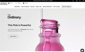
Source: theordinary.com
Create an Alternate Acronym Logo
The idea that a brand name needs to be short to be engaging and memorable is an outdated myth. Nevertheless, identifying circumstances where brevity is superior to lengthiness can be a good way to optimize your logo design tactics.
On the one hand, some brands simply have to use their entire brand names to successfully describe what they do or offer. On the other hand, there are circumstances where a bit of abbreviation or condensing could help with brand name recall and memorability.
In the latter case, creating an acronym logo that you can use to build familiarity online and offline could be a great solution to an otherwise tricky branding challenge.
If you think about it, many famous organizations adopt this approach.
NASA (National Aeronautics and Space Administration), for instance, doesn’t use its full name. And seeing that it’s clunky, long, difficult to memorize, and doesn’t look nearly as good as the organization’s well-known emblem, the choice is entirely logical and business savvy – especially if you consider that the agency has managed to turn its logo into a merchandising opportunity, with tons of products featuring the emblem and creating a valuable income.
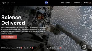
Source: nasa.gov
Pair the Name with a Strong Symbol
A similarly effective approach to overcoming the challenge of a long company name is to pair your wordmark with a recognizable symbol.
After all, knowing that people process and memorize visuals more effectively than words, relying on an image, illustration, or even an abstract pictogram could allow your brand to stand out to your target audience.
For example, the House of Hackney is a British interior and lifestyle brand that built its name on its dedication to offering luxurious products. However, the name itself is a mouthful. Using it as a wordmark could come off as too simple, which is the exact opposite of the type of product this business sells. That’s why House of Hackney designed a lavish yet recognizable symbol to use as its logo in its digital marketing campaigns, giving the brand some much-needed freedom in how it presents itself in different situations.
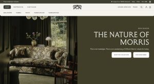
Source: houseofhackney.com
Remove Unnecessary Descriptors in the Logo
It may be tempting to use your company logo to describe what you do. Furthermore, using your company logo to differentiate your brand could be even more attractive, especially if you operate in a saturated or highly competitive industry.
However, the simple thing is that more information — at least when it comes to logo design — is not necessarily better.
Too much information can sacrifice your logo’s memorability. Moreover, it could distract your audience from purchase-influencing information, potentially even leading to information overload.
With this in mind, it’s always a good idea to remove any unnecessary descriptors or elements from your logo. You don’t have to use this limited space to communicate your organization’s structure or age — unless, of course, these are what make your brand different.
Yes, keep these terms in your company’s legal name. Nonetheless, dropping them in your logo — as Harper + Scott LLC did — is a great way to avoid visual clutter in your brand’s visual identity.
Source: harperandscott.com
Design Multiple Versions for Different Uses
Finally, as you explore tactics for making your long company name work in logo design, remember that there’s no rule for how you use your brand’s logo.
Sure, adhering to basic best practices is a good idea. Nevertheless, you don’t have to follow strict rules if they simply don’t work for your business or goals.
With this in mind, don’t hesitate to design multiple versions of your company logo. That way, you can choose the best version for each use case, giving you plenty of flexibility in your marketing campaigns.
If you do this, make sure that your logo versions still match and work together. The last thing you want to do is risk losing your target audience’s trust by having an inconsistent visual identity.
Final Thoughts
Overcoming the challenge of a long company name isn’t really that difficult. All it requires is a bit of creativity and the willingness to think outside the box.
The tips covered in this guide are all excellent options for tackling the issue of a long company name. Still, you’ll always be the best judge of what works for your business. So don’t hesitate to make unique choices in your visual branding strategy. Who knows, the atypical logo that celebrates your lengthy brand name could become the factor that helps your business stand out to your audience.


