
Visual impressions are crucial in business — whether you’re shaping your brand’s reputation, trying to earn customer trust, or looking for ways to build consumer connections. So, it comes as very little surprise that a professional, attractive, and memorable logo is one of the most essential branding assets you can invest in.
But the thing is, logos aren’t just supposed to be pretty. Research suggests that consumers regularly form brand opinions based on visual impressions.
So, in a way, your company logo is one of the first (and most powerful) opportunities to get your target audience to perceive you in the right light. And one of the best ways to build your organization’s public image is to focus on your brand’s values and characteristics. Most consumers make conscious shopping decisions based on what a business stands for.
According to data, 82% want the brands they shop to align with their principles. Moreover, younger generations are becoming increasingly committed to supporting organizations that convey a strong moral message while prioritizing traits such as trustworthiness, honesty, and consistency.
In other words, if you’re trying to find a quick and effective way to show your prospects who your band is, what they can expect, and why they should choose your solutions over those offered by your competitors, it might be a good idea to infuse your brand’s values into your logo. The following are some of the best ways to accomplish that goal.
Below, you’ll find actionable tips on how to communicate specific brand characteristics through your logotype, along with examples of businesses that have done it right. Let’s get into it.
Professionalism and Trust
Trustworthiness is a key brand characteristic in 2026. In fact, it’s so influential in the buyer’s journey that 88% of shoppers consider it just as important as product price and quality. Moreover, 80% of people actively choose to shop with brands they deem trustworthy, while 69% would abandon businesses they no longer trust.
But how do you communicate professionalism and trustworthiness with your brand’s logo?
Well, the best method to do this is to prioritize credibility-building aesthetic decisions. Clean lines, crisp typography, and a lack of any excess can successfully highlight your brand’s professionalism and credibility, allowing you to position your business in a positive light that’ll help earn customer confidence.
For example, the eXp Realty logo that John Campbell operates under is a great instance of how a simple graphic can exude professionalism. The absence of iconography removes any distraction (suggesting that the business is highly focused on solving customer pain points). The crisp, geometric aesthetic signals seriousness and competence. And the monochrome color palette accomplishes a high level of adaptability — ensuring that this company’s visual identity always looks right, no matter the setting in which the logo is used.
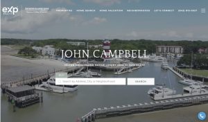
Source: johnsellshiltonhead.com
Expertise and Domain Knowledge
We’ve already covered that trust plays a major role in shaping the buyer’s journey. But is there any specific brand characteristic that inspires trust, other than professionalism?
It could be said that expertise and domain knowledge matter a lot in 2026. New research suggests that consumers have high levels of confidence in scientists, educators, and brand experts. Additionally, the era of influencers seems to have passed, with consumers prioritizing purchase advice from more knowledgeable sources.
With this in mind, it’s a great idea to explore opportunities to have your logo communicate expertise and domain knowledge.
One of the best ways to do this is with order and clarity. Skip most decorative elements, choose simple typography, and incorporate plenty of negative space into your logo. All this will help communicate calmness and confidence.
The Freeburg Law logo — which is a subdued off-white color, uses a sans-serif font, and is in all caps — is an excellent example of a text-based logotype that communicates authority without trying too hard to be clever. It’s restrained in its design — a choice that works great for high-stakes service providers because it shows they don’t need bells and whistles to prove their competence. Moreover, it demonstrates high levels of focus and seriousness, both of which are important values in the law industry.

Source: tetonattorney.com
Ambition and Innovation
To most consumer groups, dependability and trustworthiness matter more than getting their hands on the latest ‘gadget.’ But the simple thing is that modern consumer pain points require modern solutions. So, innovation and utility aren’t just desirable brand values. In 2026, they’re essential.
And there’s even research to show that this is the case. According to Edelman’s latest special report, 85% of shoppers expect businesses to demonstrate a high level of utility by effectively solving customer needs and providing innovative solutions.
But how can you use your company logo to showcase your brand’s ambition and commitment to continual advancement?
Well, unlike when you’re trying to build trust, the key to achieving this goal is to allow yourself to be bold. Give yourself creative freedom to choose daring (or even custom) typography, abstract designs or shapes, and colorful palettes. Minimalism can work as well, but there’s no need to limit yourself to it — especially if you’re aiming to differentiate your brand in a competitive niche.
For instance, the Fin logo is a refreshing visual design in the AI industry. At first glance, it seems like an abstract graphic. However, a closer look reveals that the entire logo is made up of small chat bubbles, which effectively communicate what the company does and highlight Fin’s primary differentiator — its ability to serve users at every step of the customer journey, with equal effectiveness at any stage.
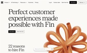
Source: fin.ai
Warmth and Authenticity
In the age of AI, authenticity is becoming an increasingly important brand value. In fact, some research suggests that many consumers are losing their trust in brands due to a lack of humanity. Additionally, 97% of people demand brands to remain authentic.
What’s interesting about digital design — and particularly your brand’s logo — is that it can be an exceptional tool for communicating humanity, warmth, and authentic imperfection.
Graphics that look hand-drawn, script or semi-script fonts, and irregular shapes in vivid colors can all signal your brand’s commitment to retaining its humanity and appeal to audiences who seek authentic shopping experiences.
For instance, you can check out Marinush. This small business sells handcrafted jewelry, clothes, and accessories, strongly emphasizing its commitment to unique, human-first design that stands out. The slightly chaotic monoline logo is a perfect reflection of Marinush’s brand identity, clearly setting this authentic business apart from the uniform big-brand stores that make up the majority of its competitors.
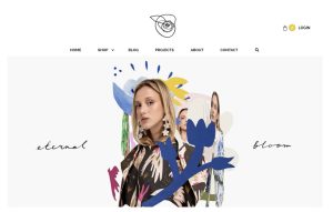
Source: marinush.com
Human Connection and Empathy
In some niches, the best way to connect with your prospects isn’t by trying to convince them that you’re the most competent entity to resolve their pain points. Nor is it always necessary to try to prove your company’s uniqueness. Instead, in some situations, all your prospects really want from your brand is to be understood.
According to consumer behavior research, 73% of consumers want brands to show they understand their personal needs and expectations. In other words, shoppers seek connection and empathy — not a sales prop — when reaching out to brands.
Your logo can shape your organization’s image in a way that supports connection and empathy, primarily by using elements that are familiar (or relevant) to your target audience.
For example, if you check out CodaPet, you’ll find that this business achieves this precise effect. The business offers a highly sensitive service that requires the brand to show that it understands exactly what its clients are going through. Because pet owners are most likely to be in a vulnerable state when exploring CodaPet’s services, this brand shows warmth and care by pairing two recognizable comforting icons: a home and the pet’s paw print.
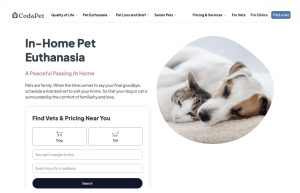
Source: codapet.com
Character and Personality
In some cases, the best way to position and differentiate your brand through emphasizing its values isn’t necessarily to focus on the customer benefits you can offer. Instead, highlighting a business’s personality can be a great way to make a logo memorable, relatable, and attractive.
And the great thing is, consumer behavior research shows that shoppers want brands that are a bit “unique.” Character is a great way to encourage emotional connection (which is a powerful driver of conversions and loyalty). It can also build trust and ensure differentiation — particularly in competitive industries.
There are several design choices you could make when aiming to emphasize your brand’s character. Unexpected color combinations, brand mascots, quirky fonts, and even motion-ready logos are all excellent choices for businesses aiming to infuse their personality into their visual identity.
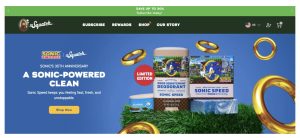
Dr. Squatch is a standout example of a brand that infuses its unique personality into its logo. The brand shows its playful nature by using a classical pose to show off its humorous mascot — a visual oxymoron that transforms the brand’s everyday products into something exciting, likable, and just a tad silly.
Source: drsquatch.com
Momentum and Aspiration
Some brand logos aren’t supposed to convey your brand’s personality, characteristics, or even offer. Instead, they simply need to reflect the outcome your target audience desires.
Aspiration is a huge purchase-influencing factor. And in an economic setting where money is worth less and less, consumers are increasingly appreciating elevated (or even unattainable for most people) products, experiences, and services.
In fact, research suggests that approximately one-third of the world’s population now falls into the category of aspirational buyers.
The notion of finer things in life comes in many shapes and sizes. For some, this may mean luxury items. For others, it’s wealth-building, personal, or professional advancement.
In either case, your brand’s logo can easily reflect your company’s role in helping customers reach their ambitious goals, whether by relying on design tactics that prioritize luxury or by using visuals that signify upward momentum.
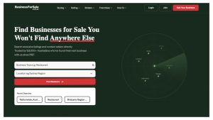
For example, Business for Sale embeds a forward-pointing arrow in its logo, a design choice that transforms a descriptive brand name into a signal that suggests advancement. The visual choice clearly reinforces the idea that acquiring a business is a step toward something bigger — an ambition that most people share.
Source: businessforsale.com.au
Heritage and Legacy
People’s growing interest in luxury and aspirational experiences has made room for a so-called heritage maximalism. From vintage collectibles to nostalgic visuals to history and tradition-inspired aesthetics, a growing number of young consumers are looking to replace algorithms and mass-produced items with items that feel genuine, familiar, and curated.
As a branding trend, heritage maximalism can be an excellent choice if your business has a rich history that it can use to attract and engage audiences. (But note that ‘faking’ legacy doesn’t tend to bode well for businesses looking to stand out.)
So, what communicates brand values rooted in history? In addition to emblems, classic typfaces, and aged color palettes, it’s also a good idea to explore opportunities to infuse a bit of detail into your logo. Think about prioritizing sketch-like illustrations, fine details, and even showcasing relevant dates in your visual identity to emphasize your business’s tradition.
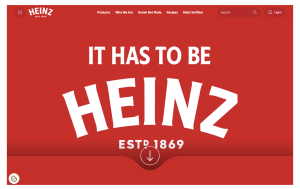
The Heinz logo, for instance, is a great example of a brand identifier that signals unchanging tradition, with an emblem that’s remained constant for most of the company’s existence. The ‘established in 1869’ message adds to the effect, resulting in a visual that’s become practically synonymous with the brand’s primary product (ketchup).
Source: heinz.com
Bottom Line
The best logo for your business will always be the design that reflects your brand’s characteristics and values. So, don’t be shy about making your logo the ideal reflection of what your brand stands for. Ultimately, it will pay off — not only in terms of a stronger brand identity but also in a higher rate of consumers who recognize and remember your business.


