
People form opinions fast. When someone sees your logo for the first time, their brain starts sorting signals right away. In a few seconds, they decide whether your brand feels credible, clear, and worth their attention.
That reaction happens before they read your copy or explore your site.
In digital marketing and web design, logos shape first impressions more than most teams expect. Typography affects clarity and confidence. Color choices affect mood. Shape and spacing affect how organized a brand appears. None of this feels conscious to the viewer, but it strongly guides trust and interest.
This matters because first impressions guide behavior. They influence whether someone stays on your site, remembers your brand, or clicks away.
In this article, we’ll break down what people actually process in those first three seconds and how you can design with that reality in mind.
Typography: Can I read and understand this instantly?
Your brain reads font style before it reads the actual words. Within milliseconds, typography signals whether a brand is serious, playful, luxurious, or approachable.
Serif fonts are more traditional, conveying a classic, authoritative tone. Sans-serifs are minimalist and modern, while script fonts hint at elegance or a more creative vibe. These are all learned responses built from years of visual exposure.
When someone sees your logo, the font tells them what kind of experience they’ll get. A law firm using a playful, rounded font creates confusion. A children’s brand using sharp, corporate typography feels cold. When typography aligns with your brand’s purpose, it builds immediate trust.
Here’s how to get this right:
- Choose fonts that match your brand personality and industry expectations.
- If you’re in finance or law, lean toward clean serif or professional sans-serif fonts.
- Creative industries can explore bolder, more expressive options.
- Whatever you choose, make sure it’s legible at any size.
- Test your logo at thumbnail dimensions. If people can’t read it on a mobile screen, it won’t work.
- Avoid trendy fonts that’ll feel dated in two years.
- Stick with one or two typefaces maximum. Too many fonts create visual chaos.
Custom Sock Lab is a brand that nails this approach. They design and manufacture personalized socks for companies, special events, and individual customers.
Their logo uses bold, slightly quirky typography that instantly communicates fun and creativity. The font choice feels expressive without becoming illegible or unprofessional.
This matters because their entire business centers on customization and personality. The typography reassures potential customers that they aren’t hiring a boring manufacturer, but working with a team that brings ideas to life with confidence and style.
Source: customsocklab.com
Symbol Clarity: Do I get what this mark represents?
Your brain craves certainty. When it encounters something unclear, it treats that ambiguity as a potential threat.
A confusing logo forces people to work harder to understand what you do, and most won’t bother. They’ll move on to a competitor whose purpose is obvious.
Clear symbols work because they eliminate cognitive load. The viewer’s brain doesn’t have to decode meaning or make guesses. Recognition happens instantly, which triggers a sense of familiarity and safety. This matters across different industries, but it’s critical in fields where trust drives decisions, like healthcare, finance, or child services.
Here’s how to get this right:
- Start by identifying the one thing your business does.
- Then find a visual element that represents that function in the simplest possible form.
- Test your symbol by showing it to people outside your industry. If they can’t tell you what it represents within a few seconds, it’s too abstract.
- Avoid trendy designs that prioritize aesthetics over meaning.
- A beautiful logo that confuses people will always underperform an average logo that communicates clearly.
Medical Alert Buyer’s Guide reviews medical alert systems and safety devices for seniors and people with health conditions. Their logo uses a device icon that immediately signals medical monitoring technology.
When you see it, you don’t have to wonder what the site covers or whether you’re in the right place.
This clarity becomes particularly valuable in healthcare decisions. People researching medical alert systems are often doing so for aging parents or their own safety concerns. They’re already anxious. A logo that removes doubt and confirms they’ve found relevant help builds instant credibility and reduces hesitation.

Source: medicalalertbuyersguide.org
Simplicity: Is this easy for my brain to process?
Your brain prefers efficiency. Complex logos demand more mental energy to decode, and when someone’s scrolling through options or walking past storefronts, they won’t invest that effort.
Simple designs get processed faster, remembered longer, and trusted more readily.
Minimalism dominates modern branding for good reason. 72% of logo designers identify it as the most popular trend in branding today. Simplified logos feel current and professional. They also translate better across platforms without losing impact.
Here’s how to get this right:
- Strip your design down to essential elements only.
- Remove decorative flourishes, excessive colors, and unnecessary details.
- If an element doesn’t contribute to recognition or meaning, cut it.
- Aim for a design that works in black and white before adding color.
- Test your logo at different sizes.
- If details disappear or become illegible when scaled down to favicon size, it’s too complicated.
- Resist the urge to cram multiple concepts into one mark. One strong idea executed cleanly will always outperform three mediocre ideas competing for attention.
A clear example is Icecartel, a brand specializing in high-end men’s jewelry like chains and bracelets. Their logo uses clean typography with a restrained icon and plenty of white space. There’s no clutter, no ornate details trying to prove luxury through decoration.
This restraint actually communicates premium quality more effectively than embellishment would. The simplicity signals confidence.
Before you see a single product, the logo establishes an aspirational, high-status position. It feels exclusive because it doesn’t try too hard, which aligns perfectly with how luxury brands build perception.
Source: icecartel.com
Color: How does this brand make me feel immediately?
Color triggers emotion before your conscious mind catches up. Within milliseconds, your brain assigns meaning to the hues it sees. For instance, red signals urgency or passion, blue suggests trust and stability, and green implies growth or health.
These are all psychological responses shaped by biology and culture.
Research shows that colors in logos can bias consumers’ ethical judgments about a retailer. The wrong color choice can ruin your logo’s aesthetics, but more importantly, it can undermine your credibility or send contradictory messages about your values and reliability.
Here’s how to get this right:
- Match your color to the emotional response you want to create, not just what looks appealing.
- Financial services lean toward blue because people need to feel secure with their money.
- Health brands often use green to suggest wellness and vitality.
- Restaurants and food services prefer red to evoke appetite.
- Choose colors that align with your industry’s expectations unless you have a strategic reason to break from them.
- Limit your palette to two or three colors maximum. More than that dilutes recognition and complicates reproduction across materials.
- Test your colors in grayscale to confirm your logo still works without relying on color alone.
- Consider the cultural context if you serve international markets. Colors carry different meanings across cultures, and what feels positive in one region might signal warning or negativity in another.
A masterclass in this is Headspace, a meditation and mindfulness app. Their logo features a distinctive orange dot that’s become synonymous with the brand. They call it their “happy orange.”
This color choice does some pretty heavy lifting. Orange evokes warmth, creativity, joy, and approachability. These are feelings that directly counter the stigma and heaviness often associated with mental health struggles.
Before users even open the app, that cheerful orange communicates that getting help with anxiety or sleep doesn’t have to feel clinical or serious. It can also feel human and welcoming.
Source: headspace.com
Shape and Form: What emotional signals does the structure send?
Shapes communicate at a subconscious level. Circles and curves feel friendly, approachable, and safe. Sharp angles and straight lines convey strength, precision, and professionalism. Triangles suggest movement and direction.
Your brain reads these signals instantly and assigns characteristics to the brand based on geometry alone.
This happens because humans are wired to assess threats quickly. Angular shapes trigger subtle alertness. They resemble sharp objects that could cause harm. Rounded shapes relax that response and create feelings of comfort and trust.
These reactions happen before you’ve read a single word about the company.
Here’s how to get this right:
- Choose shapes that match the emotional experience you want to create.
- If you’re building a security company or law firm, angular forms reinforce strength and authority.
- If you’re in childcare, wellness, or community services, curves and circles build warmth and accessibility.
- Pay attention to the overall silhouette of your logo, not just individual elements.
- Even typography carries shape language. Rounded fonts feel different than geometric sans-serifs or sharp serifs.
- Avoid mixing conflicting shape messages unless you have a strategic reason. A logo that combines aggressive angles with soft curves can feel confused or unreliable.
A perfect example of this strategy is Green Toys, a brand that sells safe, sustainable toys made from recycled materials. Their logo uses smooth shapes, circular structure, and rounded letterforms throughout. This design choice eliminates visual tension.
Parents shopping for toys are already concerned about safety and toxicity. Harsh angles would create subconscious unease. The soft geometry immediately signals comfort and reliability, which aligns perfectly with the brand’s commitment to non-toxic materials.
The logo also incorporates the recycling symbol, reinforcing sustainability without explanation.
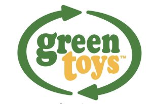
Source: greentoys.com
Balance and Spacing: Does this feel professional and intentional?
Poor spacing screams amateur. When elements crowd each other or sit awkwardly off-center, your brain registers it as careless or unfinished.
Balanced logos with intentional spacing signal attention to detail, which translates to trustworthiness and competence in business.
Visual weight matters as much as the elements themselves. A logo where one component dominates creates tension. Equal distribution of visual presence through size, color intensity, and positioning produces harmony that feels stable and deliberate.
Here’s how to get this right:
- Start with alignment. Whether you choose symmetrical balance or controlled asymmetry, every element should feel anchored and purposeful.
- Nothing should look like it accidentally shifted three pixels to the left.
- Use white space strategically. Negative space gives elements room to register individually before the brain processes them as a whole.
- Cramming everything together makes your logo harder to read and cheaper-looking.
- Leave generous margins around letterforms and between graphic elements.
- Test optical balance, not just mathematical centering. Sometimes perfectly centered elements look off because of their visual weight.
- Trust your eye and adjust until the composition feels stable.
For this example, let’s take the logo for Living Spaces, a furniture and home decor retailer. Their wordmark logo demonstrates careful visual distribution. Each letter receives equal consideration in terms of size, proportion, and spacing. No element fights for attention or feels subordinate.
The generous white space between letters prevents crowding and adds a premium feel. This breathing room makes the logo legible at any size while projecting stability.
That’s exactly what you want when selling furniture meant to anchor someone’s home. The balanced composition suggests the same thoughtfulness customers hope to find in the products themselves.
![]()
Source: livingspaces.com
Final Thoughts
While first impressions happen fast, they’re not random. In the first few seconds, a logo communicates clarity, intent, and emotional tone through choices that are fully within your control.
Typography sets expectations. Symbols remove doubt. Simplicity reduces friction. Color shapes feeling. Shape builds comfort. Balance signals care.
If your current logo feels off but you can’t pinpoint why, walk through these five elements. Chances are, one of them is sending the wrong signal. Fix it, and you’ll change what people assume about your business before they ever read your tagline or click through to your website.


