
How to Decide on the Best Logo Icon for Your Brand
Learn all about the many different categories that logo icons come in so that you can choose the one that works best for you and your brand.

Getting ready to launch your brand can be a very unnerving process as you pick your name, choose your colors and pick the logo icon to represent you. All of these factors are very important to how your clients will view your brand and who will be most interested just by looking at your logo. Choosing your logo icon is a big and important part of this process.
There are many different categories of logo icons that you can choose from. They all have their benefits and drawbacks based upon what they can do for your brand. The good part is that all of them are successfully used by one well-known company or another.
Keep reading to learn more about each catagory, how useful they would be for your brand, and how to get started choosing your own.
Abstract
Abstract logo icons are ones that are often much harder to pin down as to what they are. They are mostly created through different geometric shapes that might look similar to something in the real world.
These types of logos can be great for companies that are harder to define or put into an icon. Perhaps your brand covers too many categories or can’t be pinned down to one image. These types of logo icons can be some of the most creative and unique in the design world.
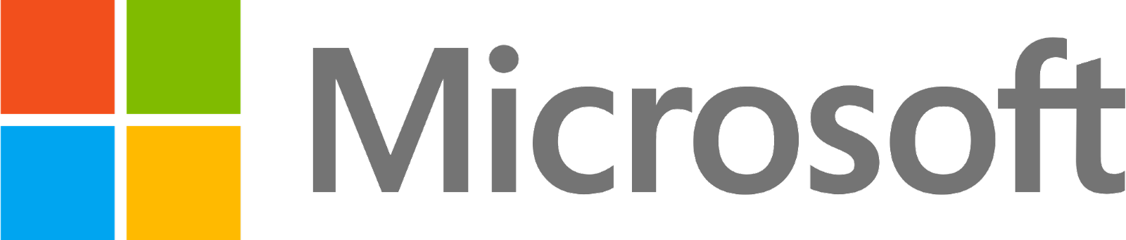
Microsoft
Microsoft represents a good example of an abstract logo icon. They have four squares that are in line with each other to create an overall box shape. Just a sliver of white is left in between them. Each square features a different color with three of them being the primary colors.
While this logo is simply some shapes, it leaves room for questions. Why those colors? Why those shapes? Why four of them? It makes consumers think about the logo which is what you want.
As Microsoft has become more successful, this logo has become something that a lot more people recognize. It is possible that the four different squares represent different parts of the company.
This type of logo can be great for brands wanting a more ambiguous logo icon, whether or not they decide to add any special meanings behind the shapes that they choose. The important thing is that the logo needs to be eyecatching and stand out amongst competitors.
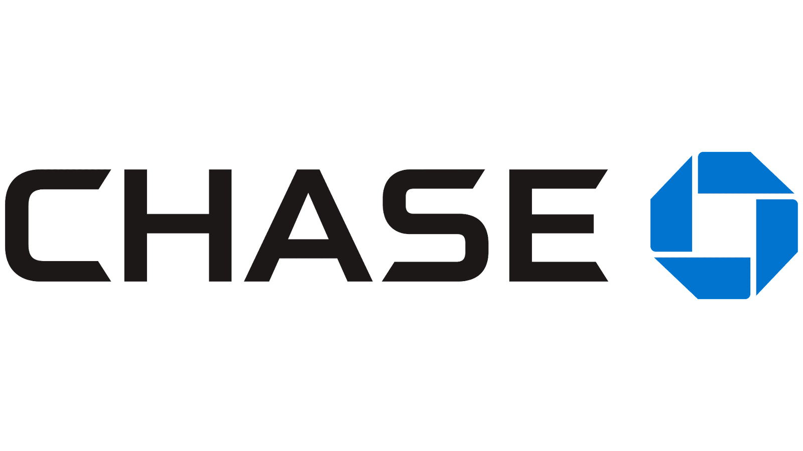
Chase
The Chase logo follows very similar principles in that it uses geometric, flat shapes that don’t inherently mean anything. The design has four irregular quadrilaterals that move in a circle. The shapes create a white square with lines extending from its edges in the background. The overall shape of the quadrilaterals is an octagon.
The logo utilizes just a few colors with a relatively simple design. Yet the image creates a motion and security within the mind of the viewer. The movement of the shapes around the solid square.
The design is simple, yet balanced and elegant. It does well to represent the ambiguous form of a bank. Other brands can use this design type by keeping their geometric design simple but smart, making the most use of their shapes.
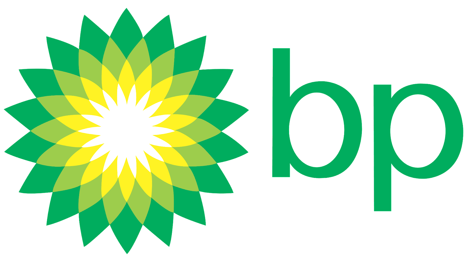
BP
BP has one of the more complex abstract logo icons out of our examples. It features a floral-like shape that is created out of numerous triangular shapes of color that range from green to yellow to white.
This company chose to use this eye-drawing geometric pattern to represent their oil company. Creating to represent the sun, it shows the importance of energy and warmth through its spreading, enveloping colors and movement of shapes.
You can mimic this design in your own brand by taking a basic idea, like the sun, and abstracting it, smoothing it down into some simple shapes and colors that represent who you are to your consumers.
Mascot Logo Icons
Mascot logo icons are pretty straightforward. They have some sort of character that represents their brand. While many companies have mascots, the only ones that make it to this classification are those that utilize their mascot in their logo.
While there are numerous companies that utilize this type of logo icon, here are some of the more popular or well-known ones.
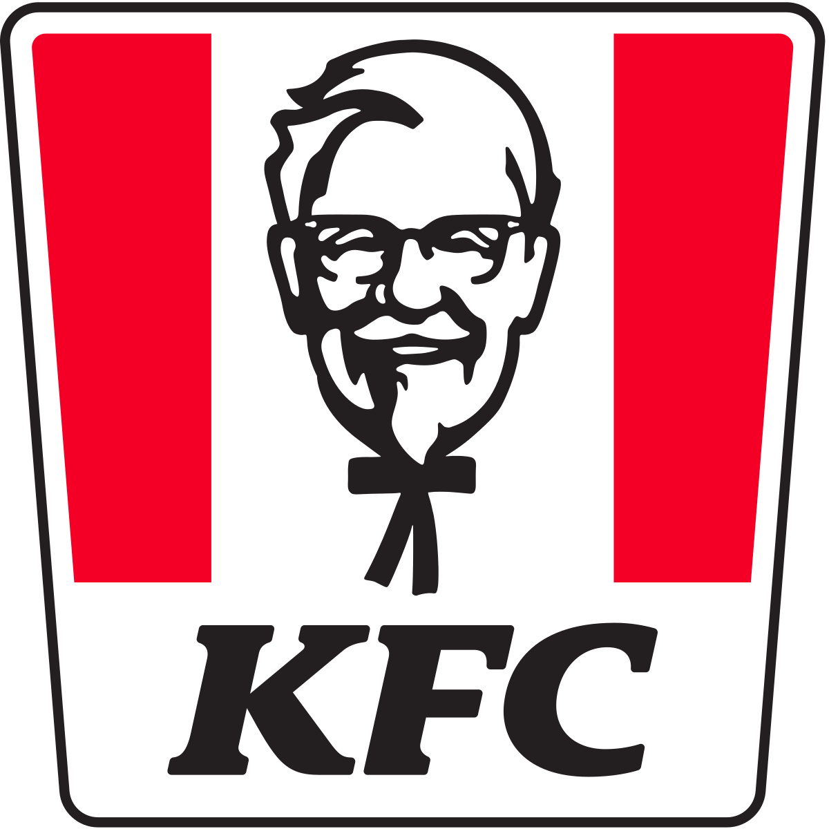
KFC
KFC or Kentucky Fried Chicken is a great example of this. Its entire brand is based upon its mascot and founder, Colonel Sanders. While their logo and imaging of him have changed over time to become a more simplified design, they continue to use their mascot and keep him at the forefront of their business.
This method of using him as their logo icon works really well. Colonel Sanders has always represented KFC and they are proud to have him do so. He is just as big of a part of the company as the chicken that they sell. For a lot of companies, the consumers have no idea who the founder is, but this is not the case for KFC.
Having your founder as the mascot for your logo icon can work really well if you have someone distinct who can represent your company well. This person also has to be willing to be in the limelight for the life of your company.
This type of logo icon will not work well for someone who is not distinct enough to represent the company or someone who doesn’t have any interest in having their image used on every piece of merchandise.
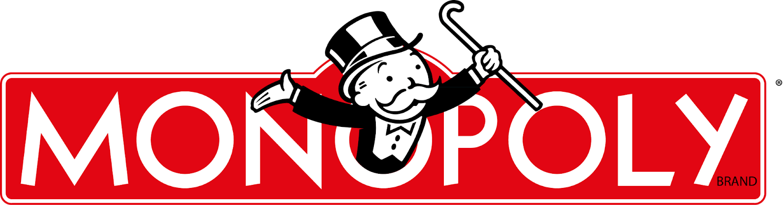
Monopoly
Monopoly is another company that uses a mascot logo icon. The Monopoly Man is a well-known figure from the game. He is not only featured in the logo but also on the game board itself and in advertisements.
While is an imaginary character, he does a good job representing his game and the goal of gaining a lot of money and resources. His specific outfit and mustache help to be recognized and stand out from other characters.
A way for your brand to utilize this type of logo icon mascot is to create a character that represents your brand well. It does not have to be a human character, but it must be identifiable and a good choice for your company.
As long as you design a good mascot this style of logo icon can work for any group. Just make sure that it looks unique enough for consumers to tell it apart from other mascots.
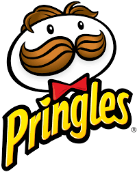
Pringles
Pringles has our last example for a mascot logo icon. This specific mascot might be the least interactive out of our examples but it still does a good job at fulfilling its requirements.
The Pringles mascot is identifiable, even with the changes it has received over the years. It gives a distinct look to the brand that they feel represents them well enough.
Any company can have a mascot logo icon that fits its needs just as the mascot for Pringles does. Just make sure to put enough time and energy into designing something that will work right for you.
Emblem
An emblem logo icon is pretty self-explanatory. They are emblems of varying shapes. Most companies choose to have their name included inside of their emblems but not all do so.
The emblems are created with important features and colors to help characterize their company and gain the attention of consumers. There are lots of different emblems used but here are three examples.
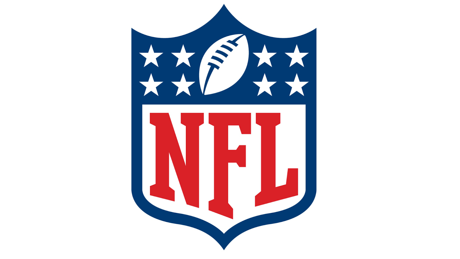
NFL
The NFL or National Football League utilizes an emblem logo icon. In a shape that is reminiscent of medals that are awarded, this is the NFL used as their emblem container. Inside their shape, they use their official colors of red, white, and blue to create their football, stars, and name.
This logo looks incredibly official while still communicating what this group is about. They utilize flat shapes of color and wonderful balance throughout the logo. It is simple and yet, it feels complex.
This type of logo can be really good for groups who want their logo to help aid their professionalism. Emblem logos add some regalness.
It is important that you don’t add too many elements to your emblem logo icon as it can easily become cluttered and unbalanced. Like family crests, you want them to be able to represent you well and still be identifiable and not too chaotic to look at.
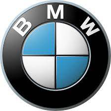
BMW
The brand BMW or Bayerische Motoren Werke AG also has an emblem logo icon. Their logo can most easily be found on any of their cars.
Its design has a nice balance with the circle in four pieces that features their primary colors and the ring of black around that. Adding their name guarantees that consumers will be able to identify them. Their logo is simple and clean to look at. It gives off a feeling of ancient prestige.
This type of emblem logo could be a great choice for a company that wants to represent its maturity and elegance. Utilizing geometrical shapes inside of an emblem is always a great choice, especially when you repeat the overall shape of the emblem.
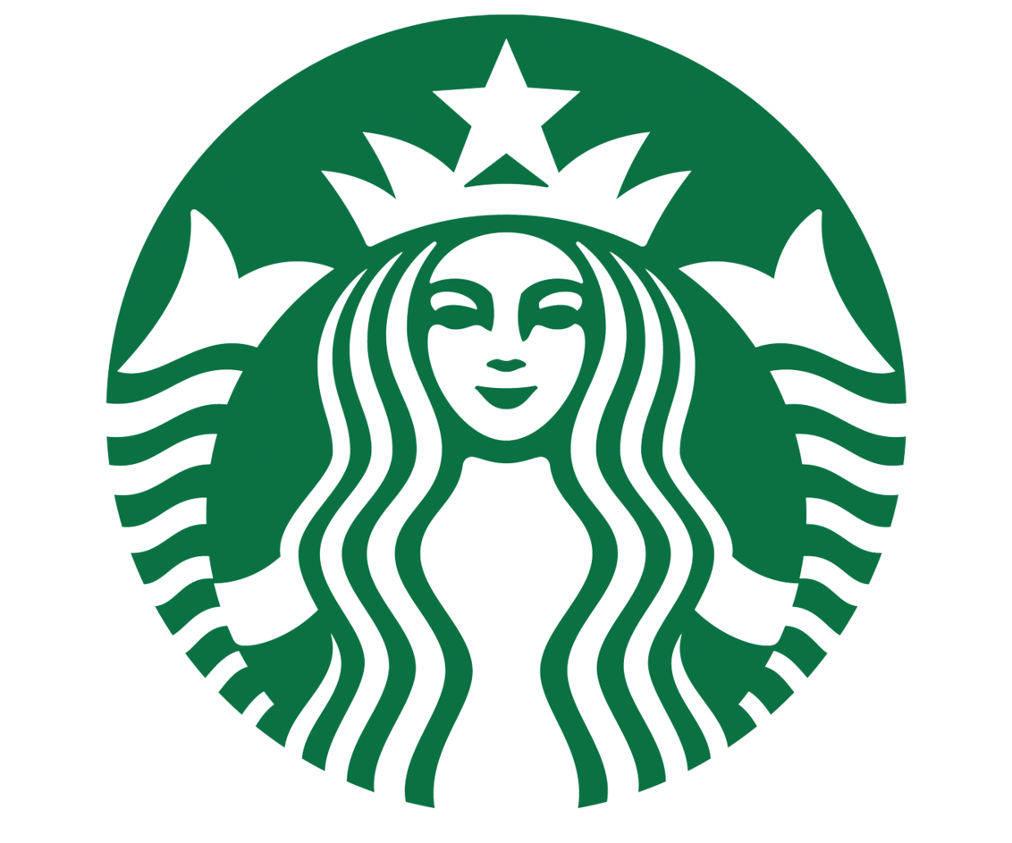
Starbucks
Starbucks is another good example of an emblem logo icon. This version is one of the newer ones but even their older logos still upheld the emblem style.
The woman figure is held within the circle emblem. In the past, their circle shape was repeated with their name located inside the outer circle emblem. Now that they are more well known, they have focused their icon on their female figure which also brings more attention to their two main colors.
Utilizing an emblem logo icon without having your name works really well if your brand is already well known and identifiable. If your company is newer or more obscure, it is better to have your name included in the design so that consumers are able to match the logo with your group.
Brand Marks
Brand mark logo icons are icons that are identifiable and already exist in our world. They could be animals, foods, locations, or other items that already exist.
It is best to pick a brand mark that is completely different from what your company is all about. The reason for this is because it is easier to trademark and copyright it when it is something else than if your brand mark is exactly what you sell. The following examples help simplify this idea.
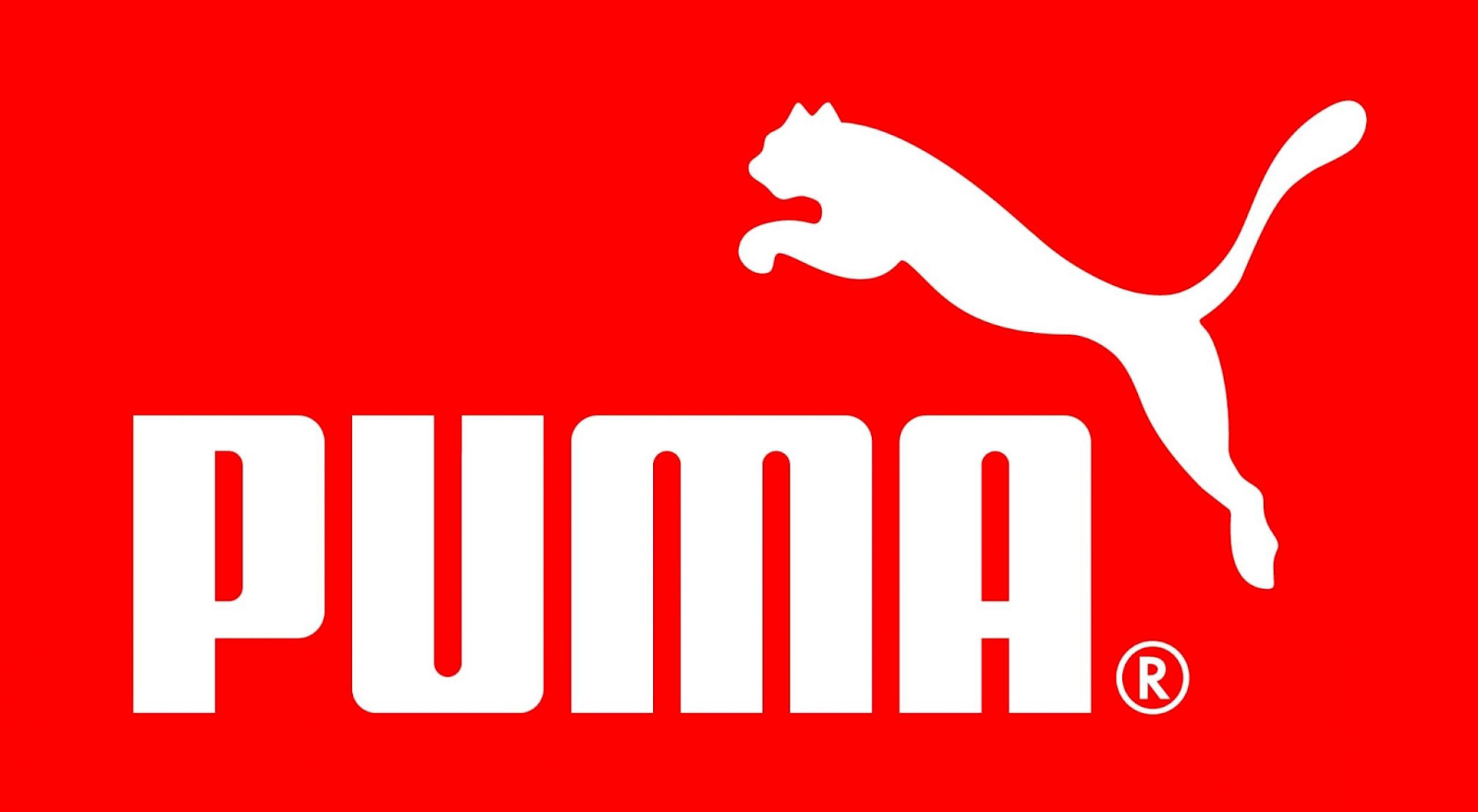
Puma
Puma is a great example of a brand mark logo icon. Their company’s main focus is selling shoes but they utilize a large cat as their main icon.
Having a shoe brand represented by a puma helps the company stand out. It makes consumers think of being active and taking charge, like the large cat it is named after.
Their brand mark is created just by having the silhouette of the puma, keeping it identifiable but also simple.
This can be a great way to go for almost any company. There are lots of animals throughout the world and perhaps there is one out there that can represent your company well. Simple can sometimes be the best route.
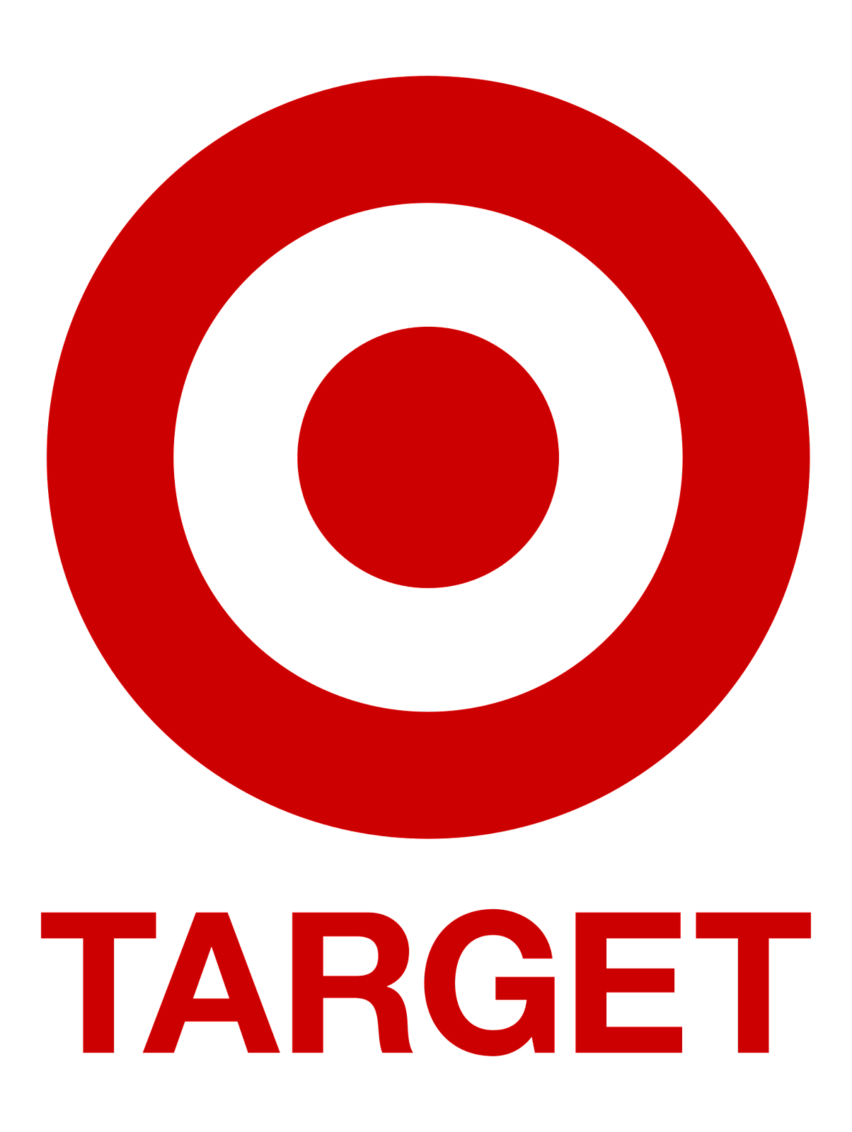
Target
The company Target provides another good example of a brand mark. In this case, they chose to have an icon that is the same thing as their name, a target.
They could have created the target brand mark in numerous ways but they decided to go simple and bold. With just two shapes, a circle and a circle outline, they are able to create a target. This design leans heavily on its geometric and abstract characteristics. Utilizing their main colors through the foreground shapes and their background shapes, they create a strong and identifiable image.
Any brand can utilize this type of imagery for themselves. It is important to keep your brand mark as simple as possible as simple logos often look the best. Once you choose an item, try to see if you can recreate it in the least amount of shapes possible.
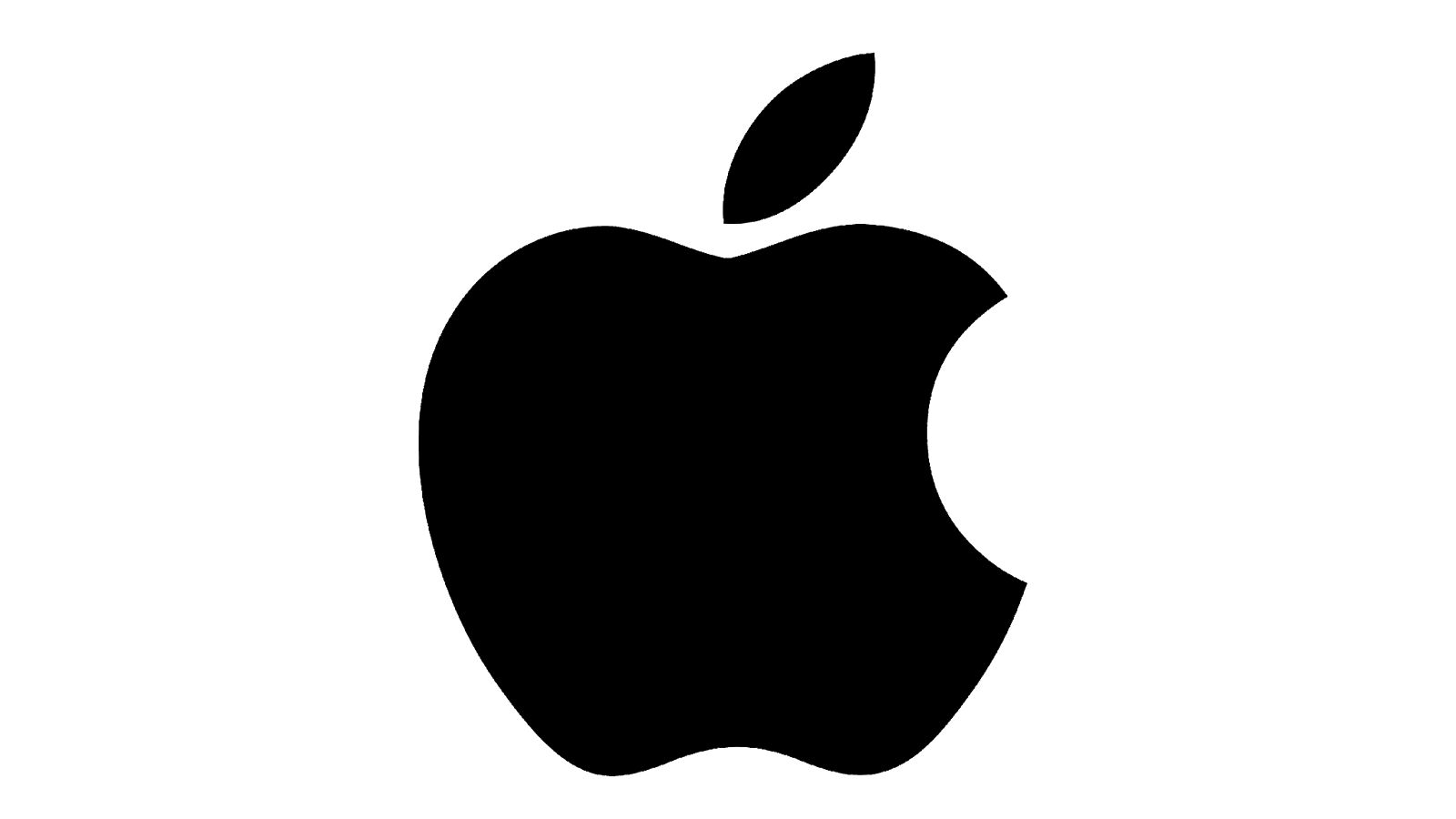
Apple
Just as with the previous examples, Apple represents a good brand mark. This technology company uses a common fruit to represent it.
Like Puma, Apple also went with a simple silhouette of their chosen item. They utilize one single color but they do not include their name. This is because they are a large enough and well-known enough company that consumers recognize their logo icon and have no further need for information in order to identify the company.
Any group or brand can utilize a fruit or other piece of food as their logo icon but make sure to also include your name in the design as well unless you are a very large and well-established company. As with the other examples, make sure to simplify your design as much as possible while still being recognizable.
Combination Marks
Combination marks are logos that utilize the name of their company within their logo. Having your company name under your logo icon does count and includes those logos in this category, but these logo examples that you will see take this idea to an extreme degree.
This type of logo can work really well if you have a good name for your company that stands out and creates a large impact. Sometimes your icon isn’t complete without your name. These logos incorporate their brand names into their logos, creating an interesting mix of icons and names.
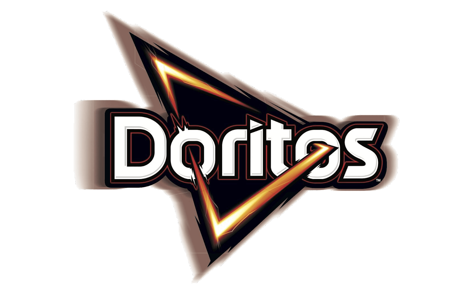
Doritos
Doritos does a good job of representing a combination logo. They have their brand name at the very center of their design and then run their triangular shape through the word, interlacing it in the ‘o’ shapes.
This logo design is one of the more complicated ones as they use a lot of colors and shading throughout the logo. While typically, simple works best, their design works for their product because it is able to represent the flavorful products that they produce.
Most brands and companies should be careful when adding a lot of colors or other effects to their design. The major issue is that when printing the logo on merchandise or other items, it might not turn out well. Try to limit how complex your logo is in order to simplify things for yourself in the future.

Pizza Hut
Pizza Hut does a good job of showing a combination logo. Almost since their very first design, they have been utilizing the hat shape on top of their name. This is reminiscent of how they used to design their buildings with the roof looking like the red hat in their logo icon.
While other versions of their logo had more colors, this version sports the simple black for the name and a mostly red hat with slight shading techniques added to it. The shaded hat adds a layer of complexity to the otherwise simple logo icon.
This type of logo can work for most brands. Pizza Hut is relying on its font and hat shape to represent them and call attention to its logo. It is simple and successful.
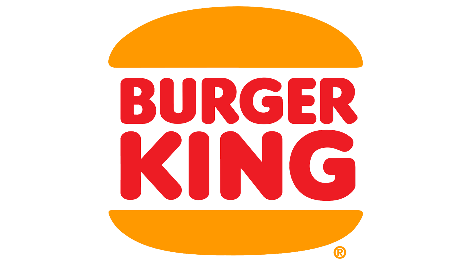
Burger King
Burger King is our last example of a combination logo. They have put their name at the center of their design and then placed abstracted burger bun shapes around it, mimicking the shape of one of their burgers.
This is similar to Doritos’ design because they are implying the shape of their food with their logo icon. This Burger King logo is a more simplified version than there has been in the past but the basic colors and nice rounded shapes help add some nostalgia to their brand.
Utilizing this design type of your own logo can work really well if you are able to suggest your product through some basic shapes. It allows your consumers to start thinking about what you are selling before they have even seen the product itself.
Choosing Your Logo Icon
Now that you know more about the different categories that logo icons fall into, you can start choosing which kind will work best for you.
In summary: an abstract logo icon is great if your company is hard to define. A mascot logo icon is great if you have a specific character that would represent your brand well. An emblem logo icon is a good choice if you want to seem prestigious. A brand mark logo icon is a good choice if you have a specific item that you want to represent you. A combination logo is great if you want your name right in the action.
Once you have an idea or two for your logo icon, you can begin to make some sketches. Make sure to flesh out as many ideas as possible to get a nice range of logo options.
After you are done sketching, you can choose which idea you would like to pursue. This is a great time to get feedback from those whose opinion matters or judgment you trust. As soon as you have chosen one, you can get designing on your preferred design platform.
If you feel that you will not bring your design justice, you can always hire a designer. But, if you still want to be involved in the process, yet you didn’t go to graphic design school, you can always use a logo creator.
LogoCreator allows you to have control over your logo but design it on an easy-to-use platform. The program makes creating your own logo a lot more simple than traditional methods and the best part is that it is free. Try out our logo creator today to create your very own logo icon.
Angela Irwin is a branding and design enthusiast with a Bachelor of Fine Arts in Graphic Design from Meadowbrook College. As a writer at Logocreator.io, she shares her expertise on logo design, graphic trends, and effective branding strategies, helping businesses create impactful visual identities.


