When making or deciding on a logo for a company, you want to make sure that your logo is good. A good logo will do better by bringing you more business and helping you to create returning customers.
Logos are the first thing that you see and they are the symbol used to represent the company in all forms. Having a good logo can be super beneficial. Here are five qualities of a good logo.
- Unique
Your logo needs to be unique and stand out from the crowd. If your logo looks like every other competitor, you will not be noticed or chosen first. A unique logo will improve first impressions from your clients and encourage them to use you for their needs.
It can be difficult to create a unique logo. Try thinking outside the box. Look at what your competitors are doing and then do something else. It will be easy for your company to remain unnoticed if its logo isn’t unique.
Consider your color scheme while you are trying to be unique. A lot of colors will fall into certain patterns. Using those colors in abnormal ways can really help your logo to be unique. In order to be unique, you must do something that no one else is doing.
- Memorable
Not only should your logo be unique but it also needs to be memorable. A memorable logo is like a catchy song or a fun tagline. It will remain in clients’ minds long after they have visited your website or store.
Any logo can be memorable as long as you put enough work into making the design really good. A memorable logo will take the place in viewers’ memories so that they can easily recall your company for future reference.
A memorable logo can be hard to make. Memorableness and uniqueness are very similar in good logos. The main difference is that unique logos are eye-catching at the moment when the viewer first sees them. Memorable logos will be thought of again, even long after they have been seen.
- Simple
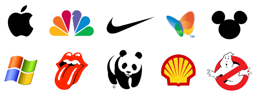
Good logos are simple and easy to understand and read. When there is too much happening in a logo, it can be hard for the viewer to look at or even remember. Having too many elements can also harm how well the design is.
Try to keep the fewest words as possible in your logo. It is fine to have your company name and a tagline, but you don’t want a whole book to be featured in your logo. People often don’t read bodies of text that are too long. It is important to keep your text short, simple, and to the point in order to keep your viewers interested.
If you have any icons or images, make sure they aren’t too jumbled or don’t have too much going on. A simple image with simple shapes is often preferred over very complex designs.
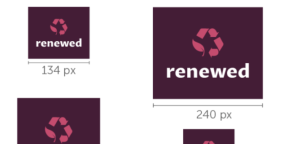
Remember that your logo could be on both large locations, like billboards, and small locations, like business cards. If your design doesn’t adjust well to become small or large, then you need to simplify it so that it can be versatile in that way.
- Timeless
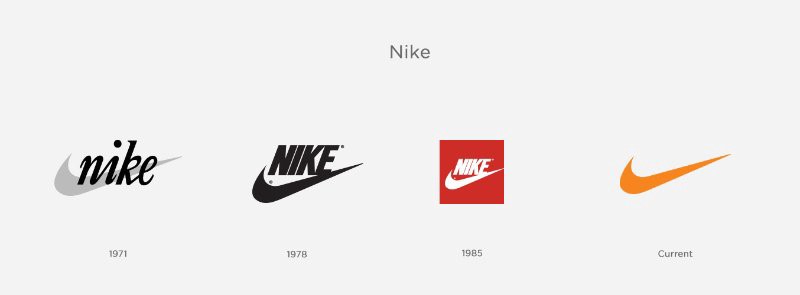
A good logo is timeless and requires little change as it ages. The logo that you create should be the one that you stick with throughout the life of your company. You might make small changes based on your needs, but the best logos will need the fewest changes of all.
Your logo should be able to stand up to pressure in one hundred years just as well as it did today. You need to make sure that your icons, words, and taglines don’t limit or restrict you.
Making a large change to your logo can be harmful to the branding of your company. Because of this, it is important that you do your best to create the very best logo that you can the first time around.
- Practical
Your logo needs to be something that you are actually able to use. A good logo is practical in application. Keep in mind the fonts or other elements that you choose and how they will look while printed. Are all of your words still legible in the font that you chose?
Can your logo handle being resized? As previously mentioned, your logo will have to fit in a variety of places. Having a crazy shape or extra lines or flourishes that extend too far can be difficult to deal with at different sizes. Simplifying your design can be very helpful.
When you go to create and save your file, it is important you save good files. Creating your logo as a vector graphics file will help you to resize it better. Saving your logo in many different file options as well as in high resolution will help you out in the future as different platforms prefer different files and sizes.
When your logo is created and done, be sure to keep the original file so that you can still go back and make edits or create new files based on your needs. It can be hard to predict everything you will need, so having the original file is very important.
Examples in Your Culture
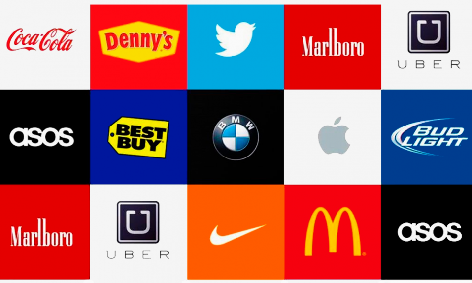
A great way to see how these qualities play into effect is to look at the logos around you. Which of these logos hold the qualities listed? You’ll find that the best and most effective logos will hold most, if not all, of these qualities.
Think of the logos of your favorite clothing, food, sports, entertainment, cars, social media, and more. The larger, more well-established companies will often have the best logos because they have the resources to put into their design.
Let’s look at the example of the fast-food company Wendy’s. This company has a logo of Wendy included with the name. This company was founded in 1884.
Throughout the time that they have existed, they have made a few changes, but overall they have remained the same. They still have the same Wendy icon, although she has had a few design changes. All of her identifying features have remained the same, however.
The font that the company decided to use has changed since its start. They began with a serif font and have since changed it to a more scripted sans serif font. This change has helped to modernize the company.
Even with the few changes, Wendy’s has stuck with its original color scheme, allowing nostalgia to remain.
Wendy’s logo is unique. There is no other character like theirs. It is also memorable and provides a good mascot for the company. The logo is obviously timeless as it has lasted over one hundred years.
While Wendy’s logo is not the most simple in the world, the design changes that they have made on their original have helped to streamline the shapes and the company name, making it more simple than how it started out as.
Their logo is obviously practical as they have been able to implement it for a long time and across a large span of ways. Their logo is a good logo.

Creating a Good Logo Yourself
Now that you know what qualities it takes to make a good logo, you can create your own. LogoCreator provides an easy-to-use platform that is one hundred perfect free. While other programs are pricy and difficult to use, our logo creator puts the focus on your usability.
In just a few easy steps, you too can have your own well-made logo. The first step is to enter the name of your company. Next, choose the industry and the icon that you want in your logo. Enter any tagline that you would like and then get to work editing. Once that is complete, you can download your very own logos.
Creating a good logo can be difficult but it isn’t impossible. A great way to determine if your logo is meeting the five qualities is to have some of your friends and family members review it. Getting outside opinions can be great to determine how to best improve your design.
The uniqueness, memorableness, simplicity, timelessness, and practicalness of a logo are all important. Having them together in the same logo helps make it a good logo.
Barry Edwards is a digital marketing expert with a deep understanding of content strategy, logo, and branding principles. Holding a Bachelor’s degree in Marketing from Beaconhill College, he offers valuable insights on digital marketing trends and strategies through his writing. Follow Barry’s work to stay updated on the latest in online marketing and branding.
